

METER Account Profile Page
People who use METER Group software products need a standard account page style to adjust their account settings and manage their notification preferences. Users also need a way to set notifications for specific rooms.
Problem: Users can only select notifications for their entire facility.
Goal: Create an account page that allows for users to set more granular notification settings.
Project Duration
Products
Team Members
My Role
Software
12.10.21 - 02.20.21
~ Three Months
AROYA, POMETA,
& SKALA
by METER Group
Luc Gensler
Paolo Bergantino
Philip Malmquist
Research, Design, Prototyping
Figma
Zeplin


01
Understand The User
Before starting the design process, the first objective in this project was to understand the user. To better understand the needs of the user, I analyzed research, reviewed user personas, and created a user journey map.

User Personas
For these designs, we need to consider our user persona, the muffled grow lead. Fernando is responsible for over seeing all the flower rooms in a facility. He needs a way to only get notification for the flower rooms. He does not need notifications for the other grow rooms in the facility.
Here is a link to the user persona overview:
https://docs.google.com/presentation/d/1bRBeM748oA8-xFWDBcjMsGH325rh4rF0xFw2nJLSVKs/edit?usp=sharing

User Journey Map
The next step in the process is to create a user journey map. A journey map documents the actions and feelings that users experience while trying to accomplish tasks. This helps us empathize with the users and their process. From here, we can identify improvement opportunities.
Here is a link to my user journey map:
https://docs.google.com/presentation/d/1_zJE2lJopMXyvP4QLclGW71AjTiXswx-gacLnaSG27k/edit?usp=sharing

02
Starting the Design
After learning more about our users, it is time to start the design process. From here, we take what we learned in the user research process and translate it into rudimentary designs. This process includes making paper wireframes, digital wireframes, creating a low-fidelity prototype, & conducting an initial usability study.
Paper Wireframes - Account
The first step of the design process is to create paper wireframes. Paper wireframes are a great way to quickly ideate and build initial concepts. This wireframe shows the layout of the account profile page. This page shows the user details about their account and the facility they work in. This would also allow users who belong to multiple facilities toggle between the facilities they belong to.

*Account Page Paper Wireframes
~ 09/05/21

Paper Wireframes - Alerts
One important factor of this account page is to make it easy for users to set their notification preferences. This notification center allows users to set custom locations for each style of notification. They can also choose whether they would like push or text style notifications. As you can see, in these paper wireframes, we had the idea of having two separate sections for notifications and account information. However, at a later stage in the design process, we blended the ideas together in a central location.
*Alert Management Paper Wireframes
~ 09/05/21

Digital Wireframes
After creating paper wireframes, it is time to create digital wireframes. This allows us to explore more details about the look, feel, and functionality of the design. Digital wireframes will become the foundation of the final product. At this stage, we can still iterate and build on the initial concepts. This screen shows the final lo-fi iteration. There were several other varieties of this screen before we chose this layout.
*Account Page Digital Wireframes
~ 09/10/21
Low-Fidelity Prototype
Now that the digital wireframes are created, it is time to build a low-fidelity prototype. This is where the lo-fi wireframes are linked together to build a functioning prototype. At this point, we can start to see the design come to life. This lo-fi prototype shows an earlier iteration of the account page.

*Account Lo-Fi Prototype
~ 09/20/21

Usability Study
After a low-fidelity prototype is developed, the initial function is tested. The design is tested by conducting a moderated usability study. This study involved 3 participants between the ages of 22-55. Each study asked users to complete several tasks. They were then asked a series of questions based on their experience. Each study took roughly 20 minutes to complete.

Analyze & Synthesize Data

Affinity Diagram
Once the data is compiled from a usability study, it is then organized and synthesized. I began this process by classifying all the observed data points and transferring the information to sticky notes. I then used these sticky notes to create an affinity diagram.
After analyzing and synthesizing the data, an affinity diagram is created. This diagram helps organize the data that was collected from our usability studies. From here, common themes are established to help draw useful insights. These insights are used to help iterate on our designs.

03
Refining the Design
Once a lo-fi prototype is built and a usability study has been conducted, it is now time to start refining the designs. Refining the design involves taking the insights from the usability studies and begin making high-fidelity mockups. These mockups will be used to develop a high fidelity prototype.
Mockups
We discovered a lot about the functionality of these design in the early stages of the design process. We knew there was a user pain point that needed to b solved for. Users needed a way to choose custom notification locations. These new designs help users do exactly that. They also offer an updated style compared to the previous implementation.

Previous Implementation (2019)

New Designs (2022)
User Flows
Our main objective with these designs was to give users the ability to select custom notification locations. This modal allows users to do that. We also are giving users the ability to manage devices that are linked to their account. These users flows show the functionality of these designs. (best viewed on desktop format)


Account page, inactive state

User is prompted to add a phone number

User adds phone number

Account page, active state

Notification location modal, allows users to set custom notification settings

Manage devices modal

Change devices modal
04
Design/Development Handoff
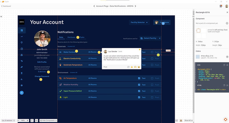
After the designs are complete, I used Zeplin.io for handing off designs to development. This helps create a line in the sand between the design process, and the development process. Developers are able to view details about the layout, and reference assets and components about the designs on Zeplin. This is basically the final stop on the design train. If a design ever needs to be iterated, then you can update the Figma file, and it will update on Zeplin as well.


05
Going Forward
Getting to solve a user pain point and also update the visual design style of the user account page has been an enjoyable project. Users now have much more control while setting their notification settings. They also now have the ability to manage devices linked to their account.
What I learned

I learned a lot during the process of redesigning the user account page. I had to make a lot of iterations early on in the process. I created dozens of paper wireframes, and digital wireframes before finding the right look and feel. Ultimately we ended up combining what I thought would be two separate pages, into one page. That turned out to be the most efficient way to present the data to the users. I also enjoyed that I got to work across multiple platforms on this project. I got to translate the design I did for AROYA into the color themes for our outdoor agriculture product, POMETA and our drying platform, SKALA.


