

Specialty Provider Portal
Optum is a branch of UnitedHealth Group that delivers technology and data to empower people, partners and providers with digital products needed to achieve better health. For this project, I created an authenticated order refill flow for Optum's Specialty Provider Portal. This feature enhancement resulted in saving the company over $100,000 / year in company savings due to reduced call center volume.
Problem: Providers currently have to manually call in orders to refill their patient's medication refills. This process is expensive and inefficient.
Goal: Create a a digital order refill flow that enables providers to quickly evaluate which patients need their medications refilled, and allowing them to submit this information digitally thus saving valuable time and resources.
Project Duration
10.01 - 11.30
~ 2 months
Product
Optum Provider Portal
by UnitedHealthGroup
Team Members
Luc Gensler
Fiaz Darvesh
Monica Muthaiya
My Role
Research, Wireframes, Mockups, Prototypes, Present to Stakeholders
Software
Figma
Rally


01
Understand The User
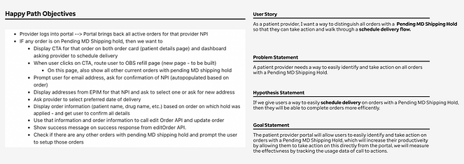
During the discovery phase of this project, I collaborated closely with our product team to define happy path objectives and create user stories and flows. Together, we developed problem statements, hypotheses, and goal statements to ensure alignment on a strategy that would enable providers to identify and schedule refills for patient orders with a pending shipping hold.
Design Strategy
The first step in creating the digital refill flow was to collaborate with the product team to define the specific feature request. By developing assets such as happy path objectives, problem statements, and goal statements, we were able to identify areas for improvement and build empathy for our users. This ensured that both teams were aligned on our goals and understood why they would be beneficial. The goal of this feature was to enable providers to digitally schedule order refills for their patients. We determined that users would need a way to identify these requests and sort the table accordingly to easily find the alerts. Once the user identifies an alert in the table, we can create a process for providers to submit this information digitally.
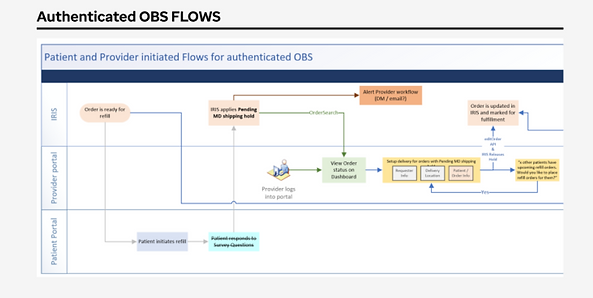
User Journey Flow
After collaborating with the product team to define the design strategy and feature requirements, we developed a user flow to map out the user's journey. This flow helped the design team understand how to create the designs for this feature, while also providing the product team with insights into the front-end systems and back-end databases that would be needed to bring these designs to life.


02
Starting the Design
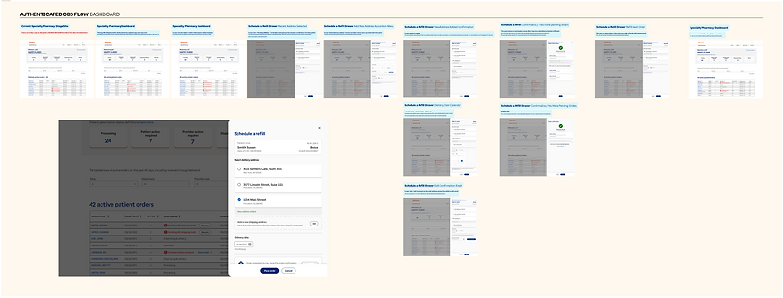
After aligning on the goals and user journey flows, we began creating wireframes and designs to meet the feature requirements. We started with paper wireframes, then moved to digital wireframes, and finally developed a low-fidelity prototype. This stage facilitates quick ideation and iteration, driven by continuous feedback from the design and product teams.
Paper Wireframes
I started the design process by sketching paper wireframes. During this phase, I presented various interaction designs to our product team, including options like a drawer, a modal, a new page, or inline editing. We ultimately chose to implement the drawer interaction. Using paper at this stage allowed me to explore and present multiple ideas simultaneously.

Digital Wireframes
The next step in the process was to translate the paper wireframes into digital format using Figma. This transition allowed me to begin refining the information architecture and hierarchy. At this stage, we also considered adding a feature that would enable users to include a new delivery address within the drawer. Although the design is taking shape, we are still working in grayscale and relying on basic boxes and lines rather than finalized components from the design library.
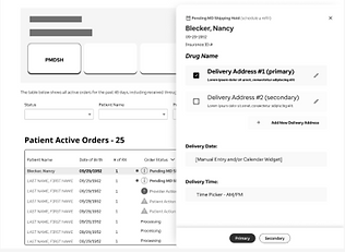
Low-Fidelity Prototype
Once the team agreed on the look and feel of the digital wireframes, I connected the screens to demonstrate the interaction design of this feature using a low-fidelity prototype. The prototype illustrated how a user could identify the area of interest on the dashboard table, select that item, and then open the drawer to add information. This information would link to HEMI, the backend database, allowing the user to submit it digitally instead of making a manual phone call to complete the process.


03
Refining the Design
The next stage of the design process is to refine the wireframes into high-fidelity mockups. This involves following the official design system and incorporating feedback from stakeholders. At this point, we also review the designs to ensure they meet current accessibility standards.
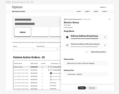
Mockups
To further refine these designs, I brought the wireframes to life by using assets from our component libraries and following established patterns. At this stage, the focus shifted more toward the User Interface (UI), with an emphasis on ensuring internal consistency and meeting accessibility standards. This process provided the product and development teams with a more realistic preview of how the designs would appear in the system.
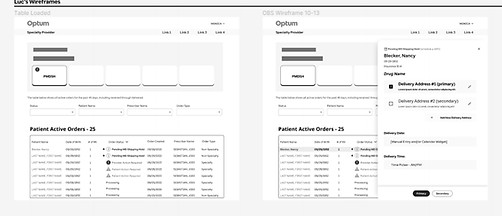
Low fidelity wireframes

High fidelity mockups
Prototype
After creating mockups that covered the entire user flow, including both common use cases and less common edge cases, I linked the screens together to form a functional prototype to share with our product and development teams. This demonstration allowed these teams to not only see the high-fidelity mockups in action but also to understand the finer details of the interaction design and how the screens flow together. It provided a final opportunity for stakeholders to give feedback before the designs were handed off to development.

04
Design/Development Handoff
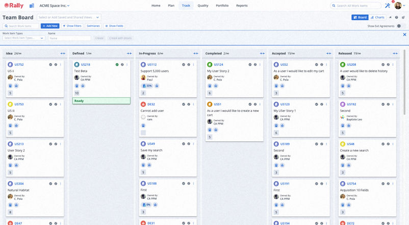
After the designs were reviewed by internal stakeholders, it was time to hand them off to our development team. For this feature, I used Rally, a Broadcom product, to align with our development team's lean and agile processes. I created a detailed story documenting the designs, including links to relevant mockups, prototypes, and assets. Additionally, I collaborated with our product owner to break these stories into manageable tasks for integration with developer sprints, gaining insights into product ownership and scrum management in the process.


05
Going Forward
Once the designs were integrated into the system, I had the opportunity to discuss their impact with our product owner. Data shared ten months after implementation showed that the new functionality was being used approximately thirty-four times per day, with each order saving the company around $12 per call. According to these metrics, the design contributed to $106,080 in annual company savings [$408 per day over 260 workdays]. It is incredibly rewarding to see how thoughtful design strategies can lead to more efficient digital processes and significant resource savings.


What I learned
I gained invaluable insights during the Optum Specialty Provider Portal project. I learned how design can significantly streamline providers' workflows while saving the company valuable resources. This project also provided a great opportunity to collaborate more closely with our product and development teams, deepening my understanding of product ownership and agile scrum management. These skills have been beneficial in working with other product and development teams. As a user experience designer, it's crucial not only to empathize with end users but also to foster strong connections with members of adjacent teams such as product and development.