

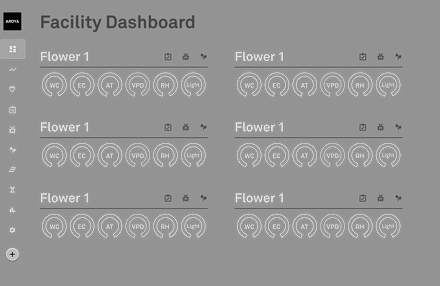
AROYA Facility Dashboard
Cannabis cultivation directors needed a way to view the average sensor data values for each of their grow rooms. Therefore, I designed and developed a new way to view the sensor data for their entire facility.
"The new dashboard is a game changer"
Josh Ginsberg, Sozo Cannabis Brands
Feature demonstration video: https://metergroup.wistia.com/medias/utsobz6cen
Problem: Users need a way to view sensor data for all the rooms in their facility in a central location.
Goal: Create a dashboard that shows users sensor data for all rooms in their facility.
Project Duration
Product
Team Members
09.01 - 12.01
~ Three Months
AROYA;
by METER Group
Luc Gensler
Paolo Bergantino
Austin Hedeen
My Role
Software
Research, Wireframes, Mockups, Prototypes, Present to Stakeholders
Figma
Zeplin


01
Understand The User
Before starting the design process, the first objective in this project was to understand the user. To better understand the needs of the user, I analyzed research, reviewed user personas, and created a user journey map.

User Personas
When designing for AROYA, it was crucial to address the diverse needs of various user types. We carefully observed the actions of the experienced owner, the tech-savvy director, and the hands-on grow lead. Each of these users would gain significant value from an improved facility dashboard page.
Here is a link to the user personas overview:
https://docs.google.com/presentation/d/1oK0lz1Jyb7xEiWFrjkit5BXuGiXOA6TFlf-mutQd0EU/edit?usp=sharing

User Journey Map
The next step in the process was to create a user journey map, which documents the actions and emotions users experience while completing tasks. This allowed us to empathize with users and understand their process, enabling us to identify key areas for improvement.
Here is a link to my user journey map:
https://docs.google.com/presentation/d/1dYRzxkGzQ29f5mjJpI7E65znKtI6qpARldejxUNevUU/edit?usp=sharing

02
Starting the Design
After gaining insights into our users, we began the design process. We took the findings from our user research and translated them into preliminary designs. This process involved creating paper wireframes, developing digital wireframes, building a low-fidelity prototype, and conducting an initial usability study.
Paper Wireframes
The design process began with creating paper wireframes, which are an effective way to quickly generate and visualize initial concepts. This wireframe outlined the layout of the facility dashboard. At the bottom of the page, I noted details about the functionality of the cards that would appear on the dashboard. Our users required a centralized solution to view sensor data across their entire facility, and this dashboard enables them to monitor sensor data from multiple rooms in one place. This was a good moment to share the initial concepts with our director of software.

Facility Dashboard Paper Wireframes
~ 09/05/21
.png)
Digital Wireframes
After completing the paper wireframes, we moved on to creating digital wireframes, which allowed us to delve deeper into the design’s look, feel, and functionality. These digital wireframes served as the foundation for the final product, providing the flexibility to iterate and refine the initial concepts. While this screen displays the final low-fidelity iteration, it was preceded by at least a dozen other versions before arriving at this layout.
Facility Dashboard Digital Wireframes
~ 09/10/21
Low-Fidelity Prototype
With the digital wireframes complete, it was time to build a low-fidelity prototype. This involved linking the lo-fi wireframes together to create a functional prototype, allowing us to see the design start to take shape. The lo-fi prototype represents an earlier iteration of the facility dashboard; while we eventually opted for a more minimal approach, this version reflects what the screens once looked like. This stage was an excellent opportunity to share the designs with our development team and product owner for valuable feedback.

Facility Dashboard Lo-Fi Prototype
~ 09/20/21

Usability Study
Once the low-fidelity prototype was developed, we tested its initial functionality through a moderated usability study. This study involved three participants aged 22 to 55, who were asked to complete various tasks and then answer questions about their experience. Each session lasted approximately 20 minutes.

Analyze & Synthesize Data

Affinity Diagram
After compiling the data from the usability study, I organized and synthesized it by first classifying all observed data points and transferring the information onto sticky notes. I then used these notes to create an affinity diagram, helping to identify key patterns and insights.
After analyzing and synthesizing the data, I created an affinity diagram to organize the information collected from our usability studies. This diagram helped identify common themes, which provided valuable insights for iterating on our designs.

03
Refining the Design
After building the lo-fi prototype and completing the usability study, it was time to refine the designs. This phase involved incorporating insights from the usability studies and internal feedback to create high-fidelity mockups and prototypes, which were then shared with the broader team and actual users for further review.
Mockups
Based on feedback from the low-fidelity designs, I made substantial improvements to give the designs a more realistic appearance and feel by incorporating official colors and style guidelines. After receiving approval from key stakeholders, including the director of software and the product owner, I proceeded to create mockups for various use cases and edge cases. Once everything was polished, I shared these designs with the marketing team and CEO for the final review.

Before Usability Study

After Usability Study
Card Functionality Explained
These screens explain how the cards on this dashboard function. A user can quickly view important data right from their dashboard. They can also interact with their journal and room graphs easier as well. (These pages are best viewed on a desktop)


04
Design/Development Handoff
Once the designs were finalized, I used Zeplin.io to hand them off to development, marking the transition from the design phase to the development phase. Zeplin allowed developers to view layout details and access design assets and components. This served as the final step in the design process. If any design updates were needed, I could easily modify the Figma file, which would automatically reflect in Zeplin.


05
Going Forward
Designing a new and useful facility dashboard was an incredibly rewarding experience. Hearing positive feedback directly from AROYA users was gratifying. However, design is inherently iterative, allowing for growth and adaptation based on user needs. I look forward to seeing how this design evolves and develops over time.
Impact
According to Pendo.io, the facility dashboard has already seen a significant increase in traffic by about 1,500 views/week since implementing this new view of the facility dashboard about a month ago. That is about a 30% increase in traffic within 30 days.


What I learned
Building a new view for the facility dashboard was an exciting project to work on with the AROYA team! I gained valuable insights into both the product and the team throughout this process. AROYA's parent company, METER Group, manufactures advanced agricultural sensors like the Teros 12, which measures soil metrics such as EC and water content. This technology helps cannabis cultivators monitor conditions in the root zones of their plants. Working for a company at the cutting edge of agricultural technology is fantastic. As a UX designer, I appreciate the opportunity to understand and empathize with cannabis cultivators. I hope this new dashboard view will simplify how users access information about their grow rooms across the facility.