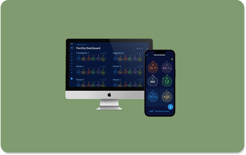
Facility Dashboard
Overview: I designed a data-rich dashboard that unifies environmental sensor data, production metrics, and real-time alerts into an intuitive, high-efficiency interface used by some of the world’s largest commercial grow operations.
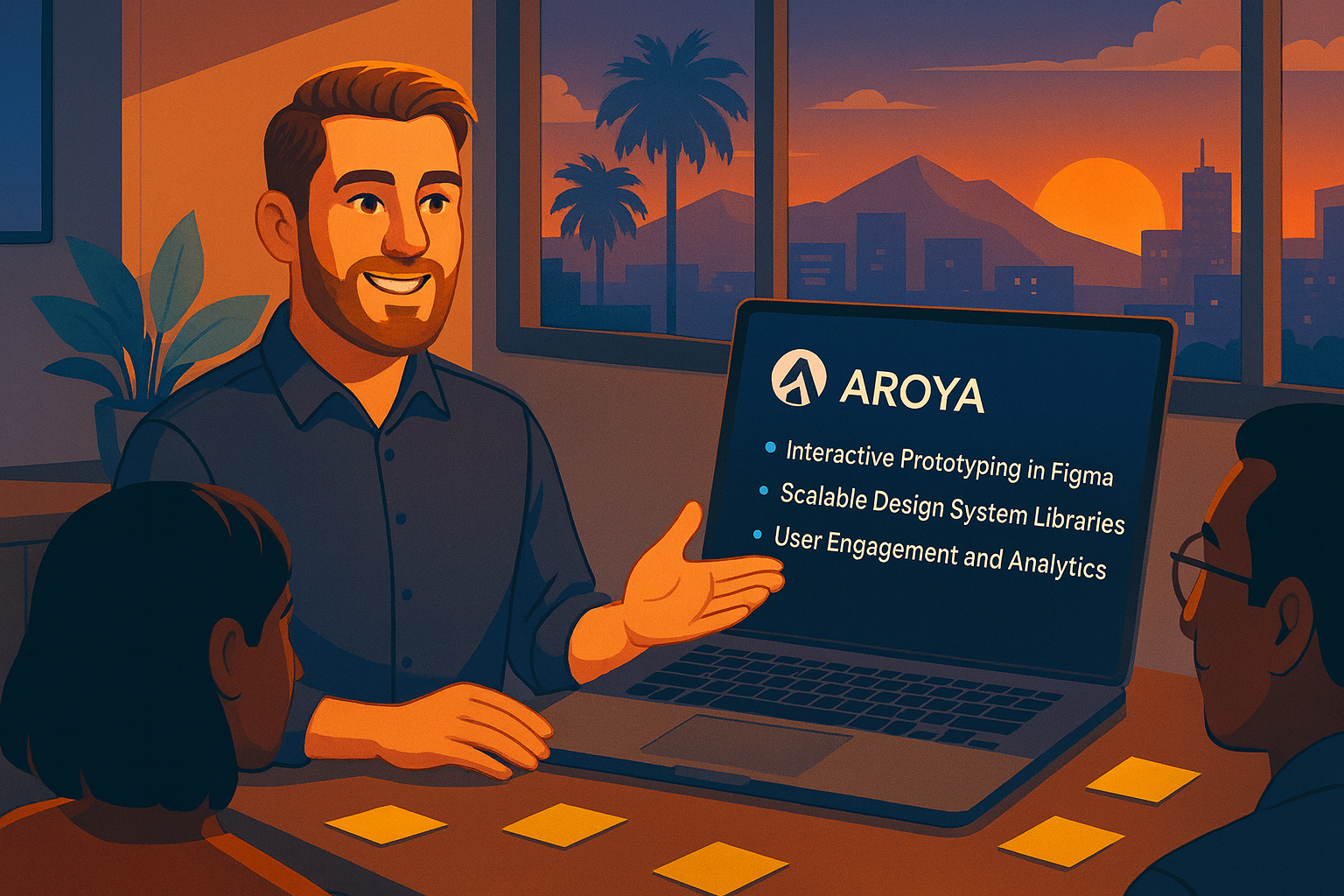
Product: AROYA // Company: Addium Inc. (Formerly Meter Group)
Role: Lead UX/UI Designer // Contributions: Research, Wireframes, Mockups, Prototypes, Usability Testing, Stakeholder Presentation
Team: Software Director // Lead Developer // President & CEO
Technology: Figma for Design // Zeplin for Development Handoff // Google Suite for Collaboration // Pendo for Analytics

Project Summary
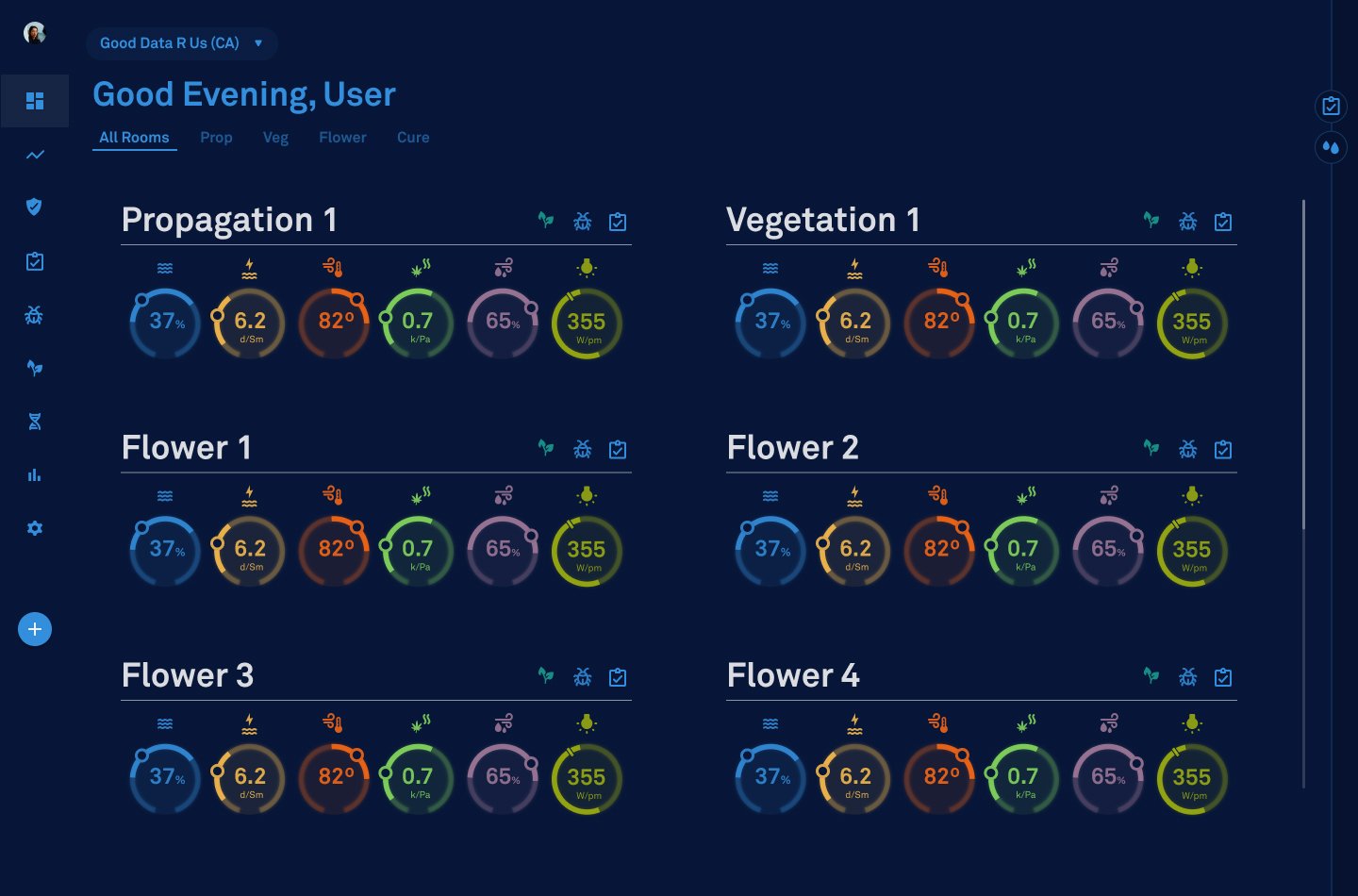
For this project, I designed and launched the Facility Dashboard—a real-time hub that centralizes sensor data from every room in a commercial grow operation. Before this, managers were tracking conditions manually across scattered spreadsheets, slowing decisions and creating avoidable errors. I began with targeted user interviews and workflow analysis, then moved into wireframes and high-fidelity prototypes. I designed the final interface to be intentionally simple: hover over any metric to view its target range, add journal notes directly on room cards, and instantly review harvest groups and IPM treatments. I partnered closely with engineering to refine the details, collaborated with marketing on positioning, and kept executives aligned through regular demos. I also owned QA for every design decision we shipped. The impact was immediate—feature adoption increased sharply, workflows became more efficient, and managers gained the real-time clarity they needed to make confident operational decisions.
Problem Statement: Facility managers lacked a centralized way to monitor environmental and sensor data across multiple rooms, forcing them to rely on manual tracking and reducing operational efficiency.
Goal Statement: Design a unified dashboard that allows users to view, interact with, and manage all facility sensor data in one place—enhancing visibility, usability, and decision-making for large-scale agricultural operations.
The Process
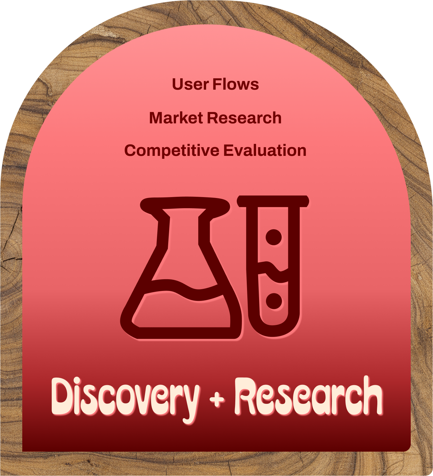
Discovery + Research
To gain an understanding of what AROYA’s users needed, I began with a structured discovery phase. I conducted a heuristic evaluation, interviewed real users, revisited key personas, and mapped their end-to-end journeys. This work helped me evaluate workflows, frustrations, and mental models with much greater clarity, giving me the empathy and insight needed to design solutions that genuinely improve their day-to-day experience. It also established a strong foundation for every design decision that followed.
User Experience Design
Once I had a clear understanding of the requirements and user needs, I moved into the design phase. I began with paper wireframes to explore layout options, then translated the strongest ideas into low-fidelity wireframes and an interactive Figma prototype. Then, we conducted usability testing focused on navigation and clarity that surfaced a few areas of focus—including identifying rooms undergoing IPM treatments. I refined the structure and hierarchy based on this feedback, creating an intuitive foundation for the high-fidelity designs.
User Interface Design
After gathering insights from internal stakeholders, I translated the feedback into high-fidelity mockups using Figma. Then, I worked within our established design system and component library to refine each screen, ensuring visual consistency and a polished, production-ready look. This phase also provided an opportunity to confirm that every element met accessibility standards, ensuring the final experience was both intuitive and inclusive. These refined mockups set a clear direction for development.
Interactive Prototyping
With the high-fidelity mockups complete, I connected the screens to create an interactive prototype. This allowed me to demonstrate the interaction patterns, interface, and user journey in a realistic flow. It also served as a valuable tool for stakeholder review, providing teams with a clear understanding of how the experience would function. The feedback at this stage helped validate the final direction before development, ensuring the design was both intuitive and technically feasible.
Design Handoff
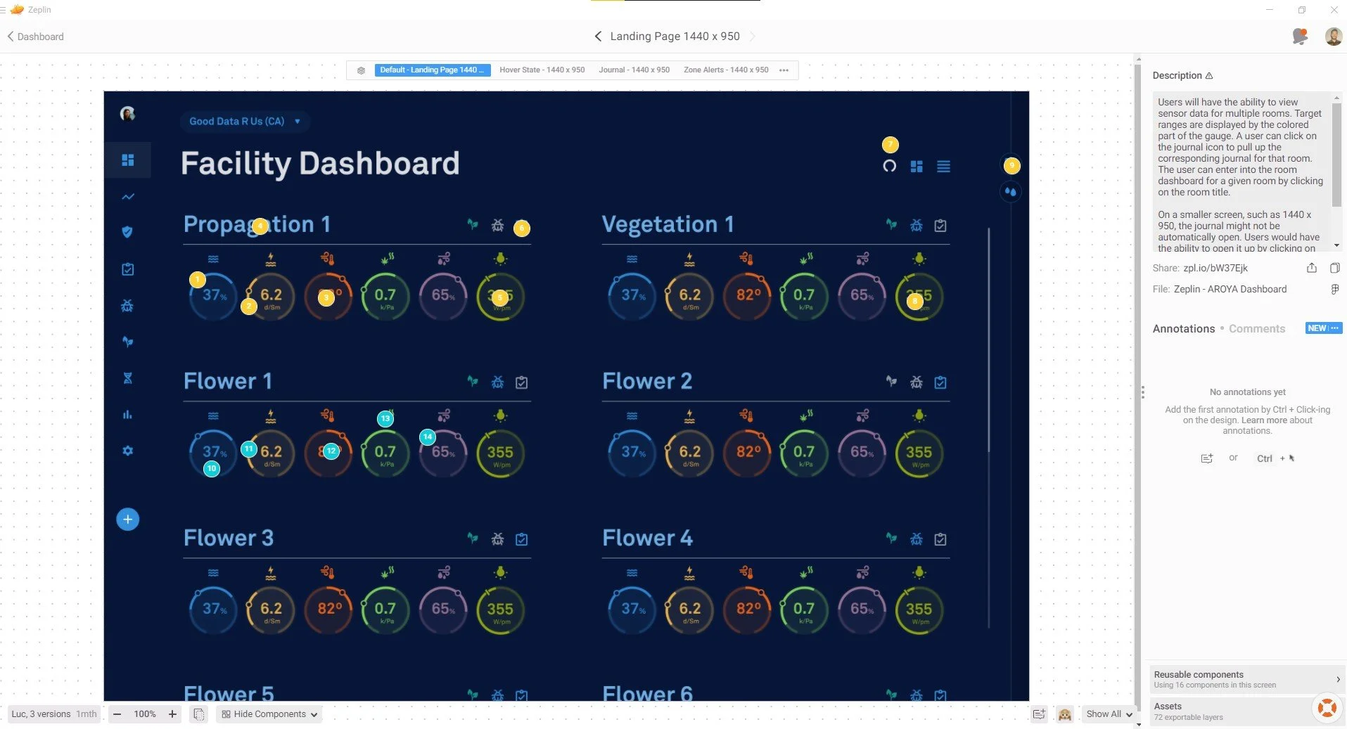
To streamline the design-to-development handoff, I utilized Zeplin to link the Figma designs and provide clear, detailed annotations explaining the functionality and interaction behavior. I partnered closely with the development team throughout implementation to ensure accuracy and alignment with the intended experience. Once the build was complete, I conducted design quality assurance (DQA) to verify that every component, layout, and interaction in production matched the original high-fidelity designs.
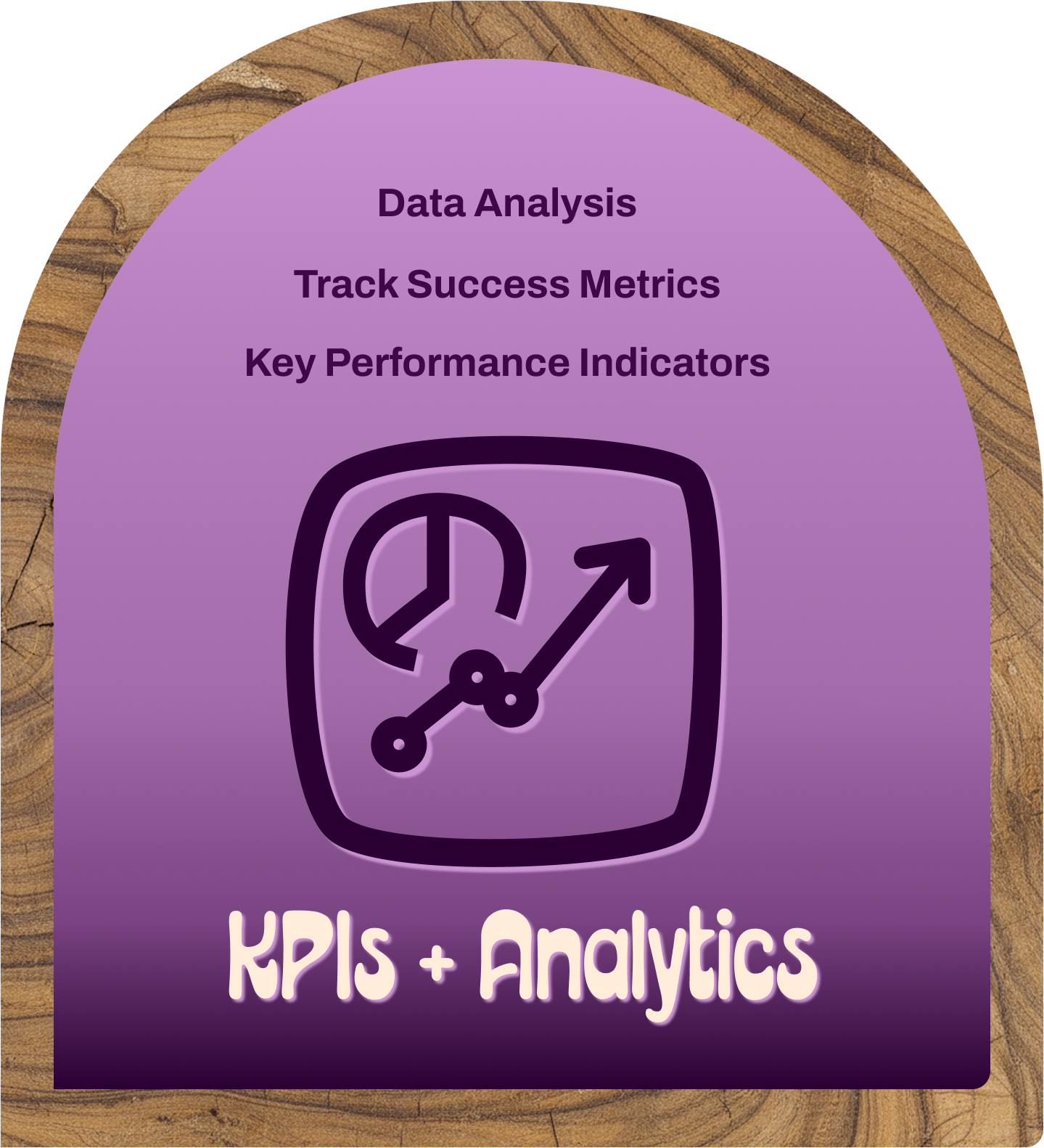
KPI + Analytics
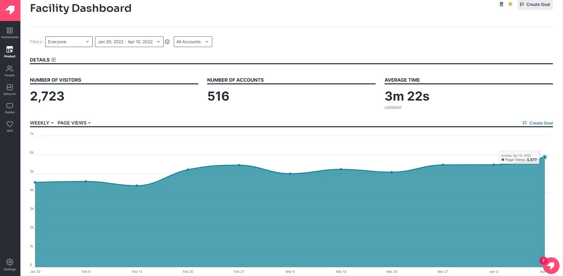
Once the facility dashboard had been live for several months, I measured its impact by tracking usage metrics through Pendo. In the first month alone, the dashboard received 2,723 visits from 516 unique accounts—a dramatic increase in traffic compared to the previous period. Combined with consistently positive user feedback, these metrics validated that the new design was driving adoption, improving workflows, and delivering meaningful value to facility managers.

Discovery + Research
The initial step in the design process is building a clear understanding of AROYA’s users and their workflows. I conducted a heuristic evaluation, interviewed real users, revisited personas, and mapped end-to-end journeys to uncover pain points and inefficiencies. Synthesizing these insights provided me with the empathy and context necessary to design solutions that align with how cultivators actually think and work. This discovery phase created a strong, research-backed foundation for the design decisions that followed.
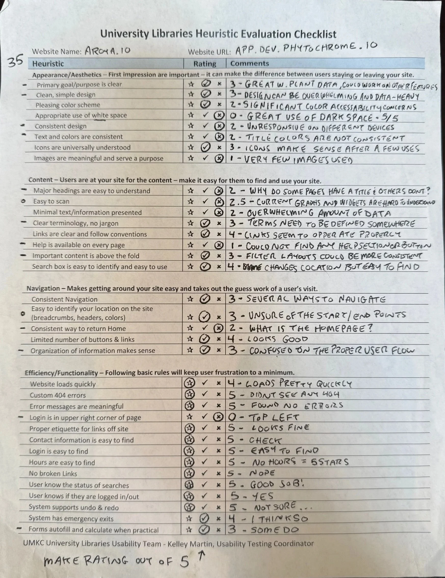
Heuristic Evaluation
As part of the discovery work, I conducted a heuristic evaluation to identify early usability gaps in the existing experience. A heuristic evaluation is an assessment where the interface is reviewed against established usability principles to quickly identify friction points without requiring a full user study. By comparing the interface against these criteria and core business objectives, one key need became clear: users needed a way to view real-time sensor data for each room in their facility.
This insight guided the next phase of the project, creating a centralized dashboard that surfaced the most important environmental data in one place, giving cultivators immediate clarity and control.
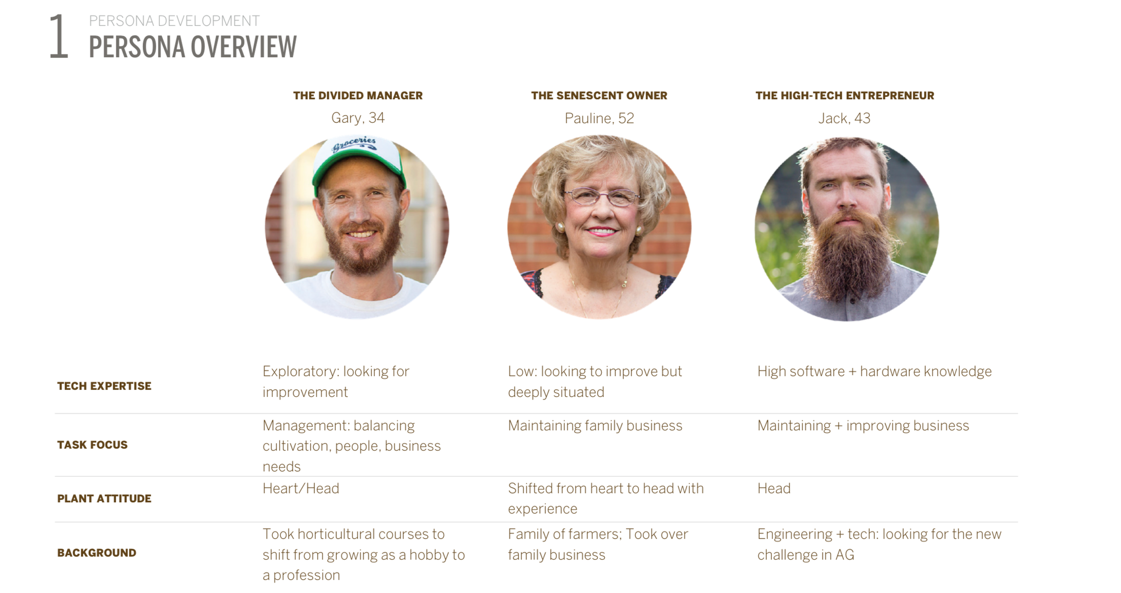
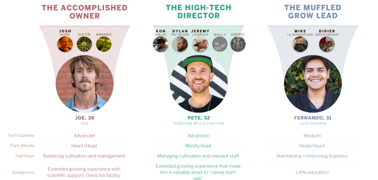
User Personas
A key part of the discovery phase was evaluating AROYA’s user personas. Personas are research-backed representations of core user types that capture their goals, behaviors, and pain points, helping designers stay grounded in real needs. For this project, a third-party consulting group developed six personas representing different cultivators and facility operators. These perspectives guided our design decisions, ensuring that every feature and workflow aligned with how AROYA’s users actually think and work.
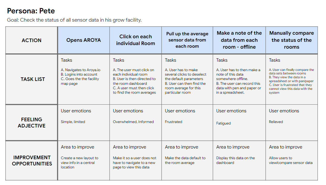
User Journey Maps
Another key deliverable in the discovery phase was creating user journey maps. These maps helped outline each persona’s actions, motivations, and areas of improvement as they interacted with the platform, highlighting where workflows supported or hindered their goals. This clarity helped us identify the most valuable opportunities and directly informed the features prioritized in the dashboard design.
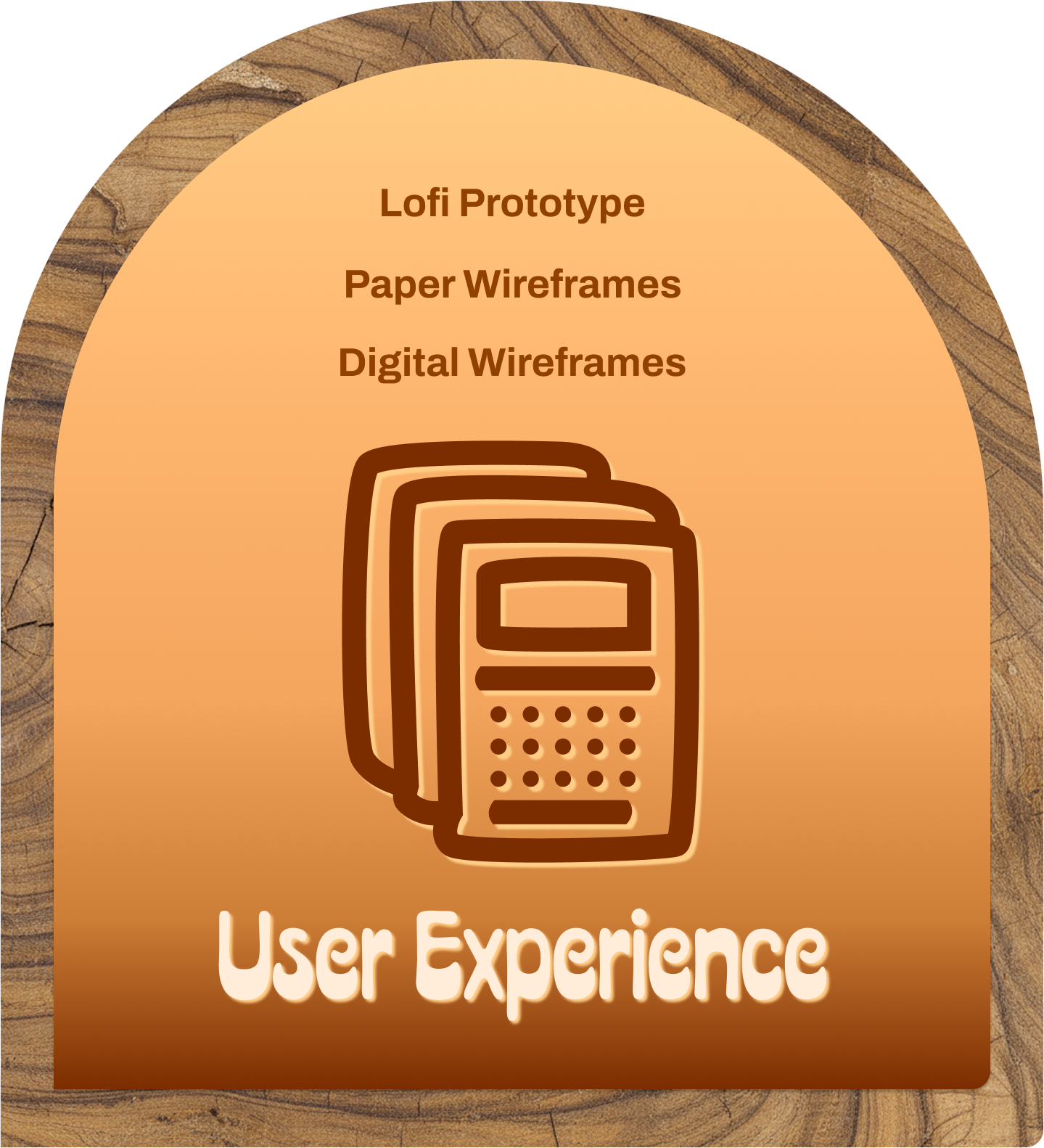
User Experience Design
With a solid foundation of user research, I moved into the user experience phase to begin shaping the interface. I started with paper wireframes to quickly explore layout ideas, then translated the strongest concepts into digital wireframes and built a low-fidelity prototype in Figma. Then, I conducted user testing to gather feedback that helped refine the structure and validate the direction before moving into higher-fidelity work.
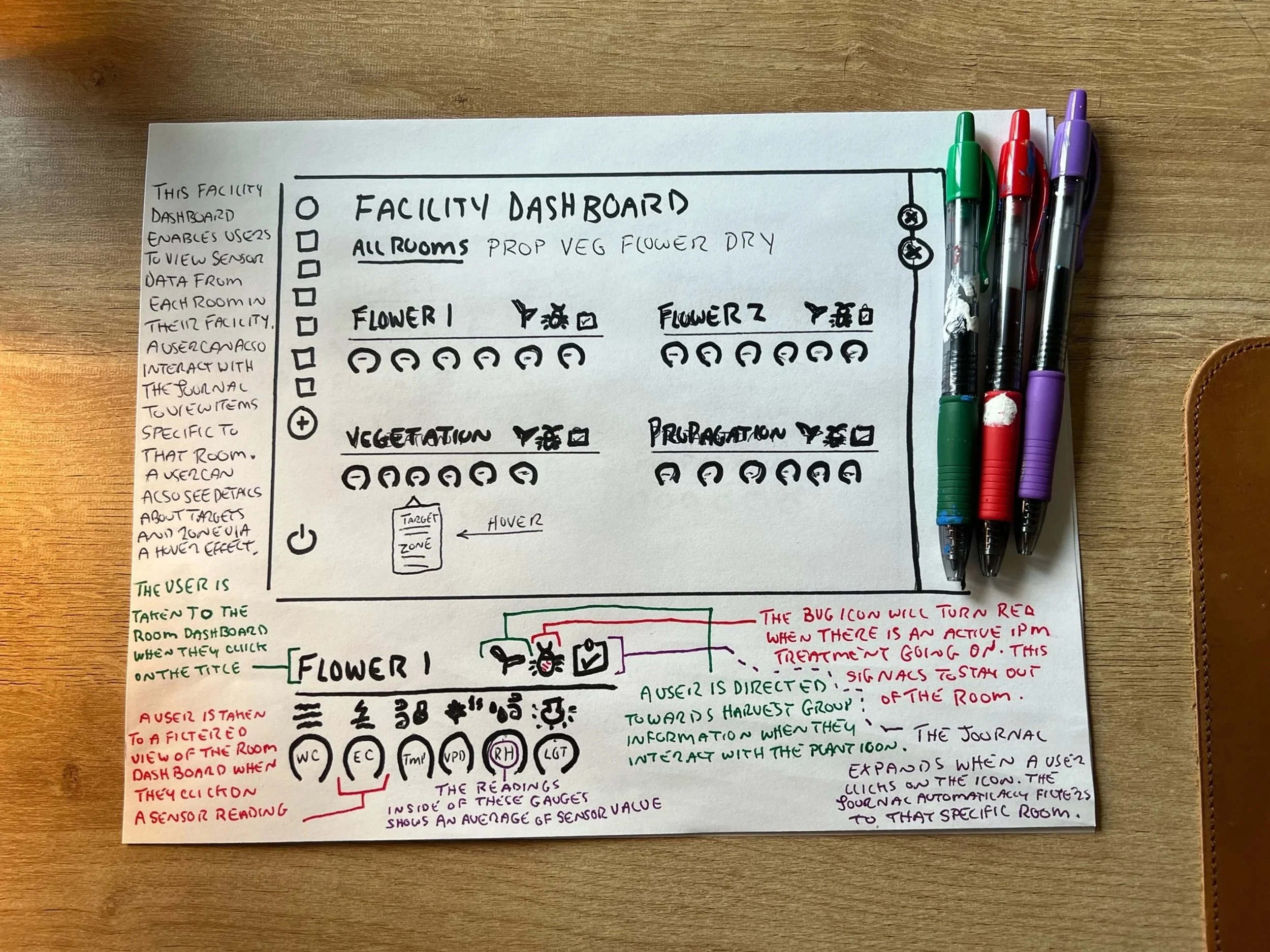
Paper Wireframes
To begin the design process, I sketched a series of paper wireframes to explore multiple layout ideas quickly and refine the core concept before moving into digital tools. The low-fidelity approach enables rapid iteration and early validation with minimal production effort. We reviewed these sketches with internal stakeholders, gathering feedback that helped confirm the design direction and highlight adjustments. Once aligned, I transitioned the approved concepts into digital wireframes for deeper exploration.
Digital Wireframes
With stakeholder feedback from the paper wireframes aligned, I translated the concepts into digital wireframes in Figma. At this stage, I kept the designs in grayscale, using simplified shapes to stay focused on layout, flow, and structure rather than visual styling. This fidelity level encouraged open discussion, helped surface gaps early, and enabled stakeholders to evaluate the overall approach. Digitizing the concepts also ensured alignment before moving into higher-fidelity design work.
Low-fidelity Prototype
As the concepts took shape, I connected the digital wireframes in Figma to form a low-fidelity prototype. This allowed stakeholders to experience the intended workflows firsthand and understand how users would move through the system. The prototype illustrated how cultivators could access multi-room sensor data and detect issues quickly, helping validate the design direction before transitioning into high-fidelity work.

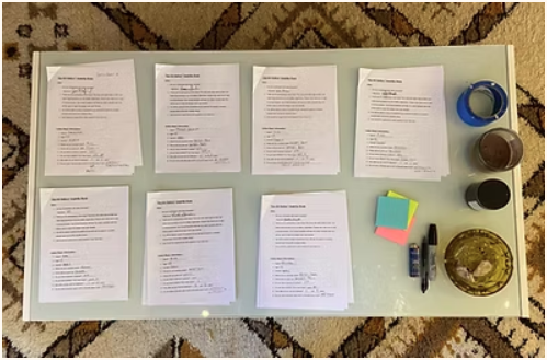
Usability Study
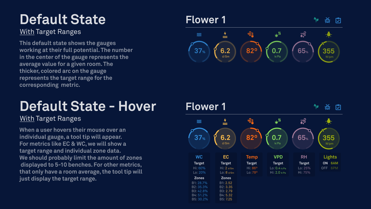
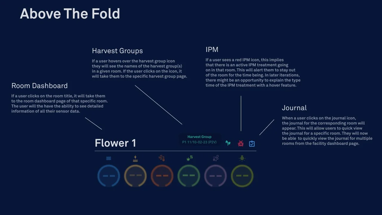
To evaluate how well the concepts supported user needs, I conducted a usability study with key stakeholders and one of our most collaborative customers. Using 24 structured questions, I gathered both qualitative and quantitative feedback to guide iteration. One significant improvement from this study was integrating IPM visibility directly into the dashboard. I added an IPM status icon that turns red and reveals treatment details when hovered over, helping users quickly determine whether a room is accessible.
User Interface Design
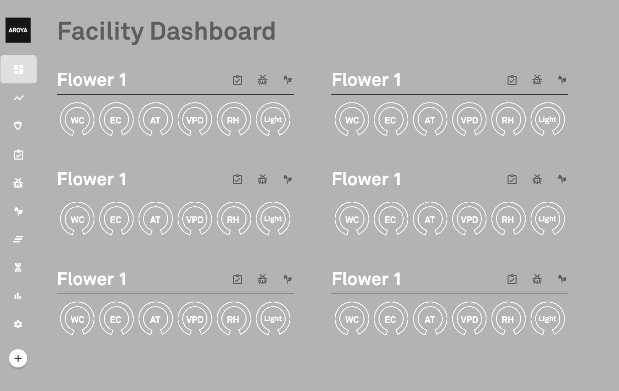
During the UI design phase, I refined the low-fidelity wireframes into high-fidelity mockups, adhering to AROYA’s established design system. This allowed me to apply defined colors, typography, spacing, and component patterns to the new dashboard so the designs flowed seamlessly with the existing product. Maintaining consistency at this stage was essential—it preserved brand cohesion, avoided visual friction, and set the foundation for a polished final experience that felt native to the platform.
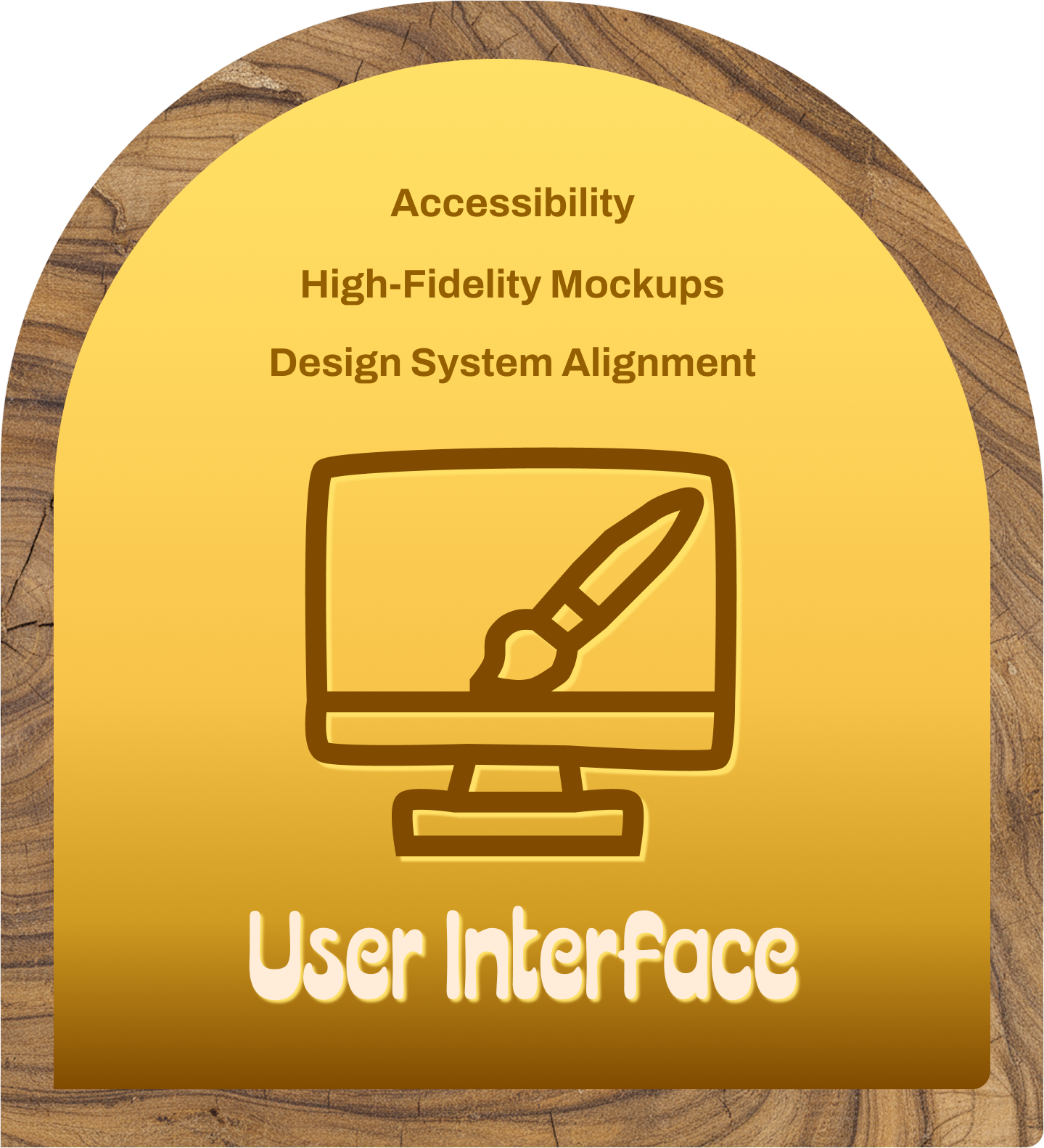
High-Fidelity Mockups
As I moved deeper into the UI phase, my first priority was translating the structural wireframes into designs that matched AROYA’s visual language. I applied the system’s color palette, typography scales, spacing rules, and iconography to ensure the new dashboard felt fully integrated with the existing product. This step established visual clarity and cohesion early on, helping the interface take shape in a way that supported both usability and brand consistency.
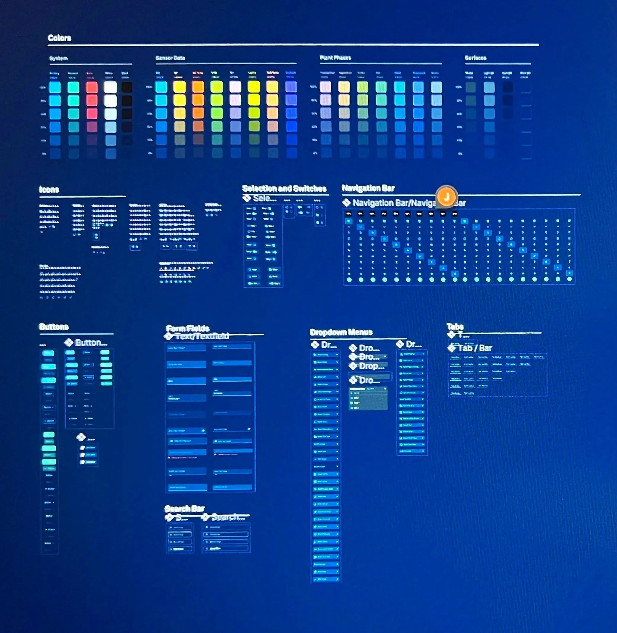
Design System Alignment
In addition to designing the dashboard, I helped build and maintain AROYA’s design system in Figma. This library included color logic tied to sensor data, standardized typography, iconography, and a full set of reusable interactive components with defined states. Using these system elements ensured visual consistency across the platform and gave developers a predictable, scalable foundation—linking directly to front-end libraries and accelerating implementation. Strengthening the system also improved collaboration, allowing design and engineering to iterate more efficiently across future product updates.
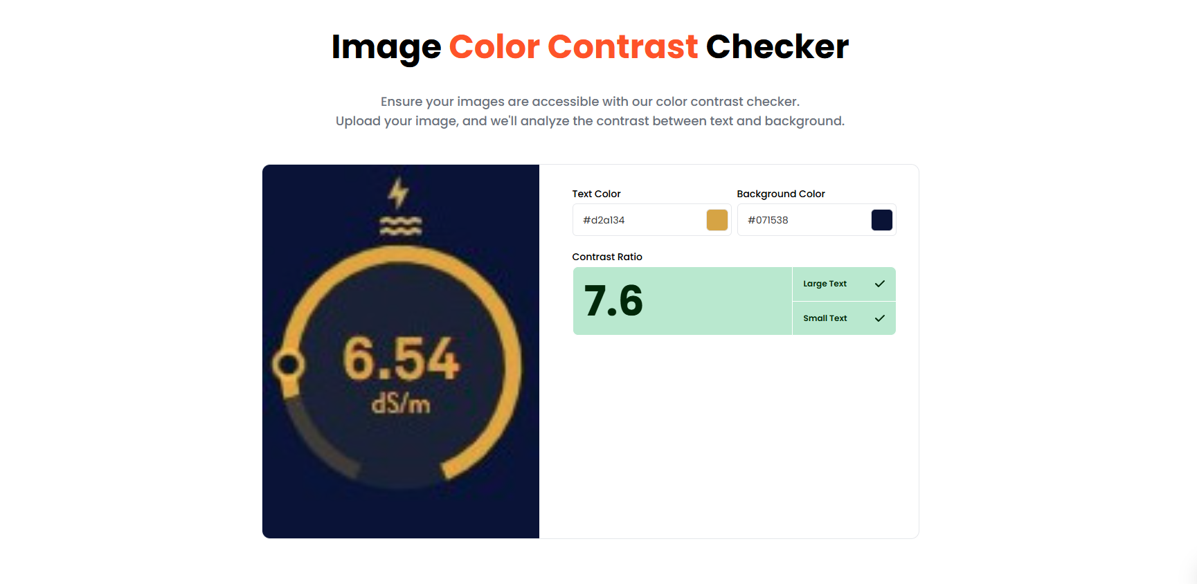
Accessibility
During the heuristic evaluation, we identified several opportunities to strengthen the design system’s accessibility—particularly around color contrast. Improving contrast not only supports users with visual impairments but makes the interface clearer and easier for everyone to use. Prioritizing accessibility at this stage ensured the dashboard upheld inclusive design standards and helped guide future component adjustments within the system, ultimately contributing to a more readable, usable, and effective product experience.
Interactive Prototypes
Once we finalized the mockups, I built an interactive prototype by linking the high-fidelity mockups in Figma. This allowed me to model the intended interactions, transitions, and user flows in a realistic way, making it easier to evaluate design patterns and gather targeted feedback. Sharing the prototype with stakeholders provided a clear, tangible view of the experience and helped secure final alignment before handing off the designs to development.
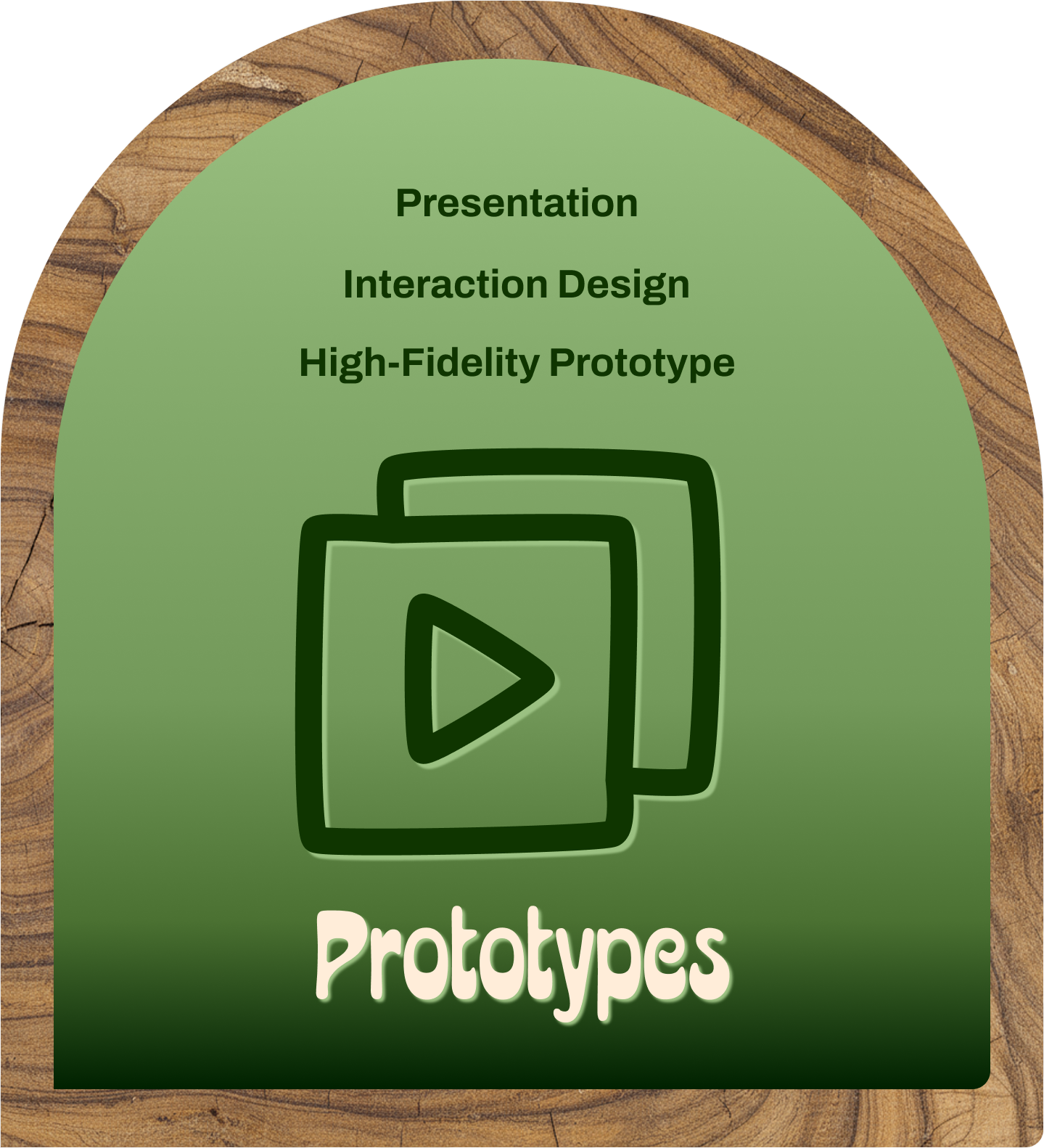
High-Fidelity Prototype
Once the high-fidelity mockups were complete, I connected the screens in Figma to create an interactive prototype that illustrated the full user flow and core interaction patterns. Walking stakeholders through this prototype provided a realistic sense of how the feature would function in practice, helping secure final approval on the design. The prototype also became a valuable asset for the marketing team, enabling them to demo the new functionality to clients with confidence.
Interaction Design
As I refined the prototype, I focused on strengthening the key interaction patterns. I added hover states that showcased the user’s target ranges for each sensor reading. This helped users quickly understand if values fall within acceptable limits. I also made the journal icons interactive, allowing users to open entries from each room card. To support safety, the IPM icon now changes color and displays a descriptive hover state, allowing users to instantly see whether a room is safe to enter.
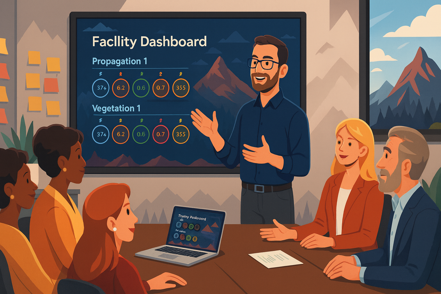
Stakeholder Presentation
Creating a high-fidelity prototype provides an ideal way to present the finalized designs to internal stakeholders. I walked the development team, marketing team, and executive leadership through the prototype to demonstrate exactly how the experience would function. This alignment step ensured every group understood the direction, approved the interactions and layout, and felt confident in what we were investing development resources into. It also unified expectations before the build phase began.
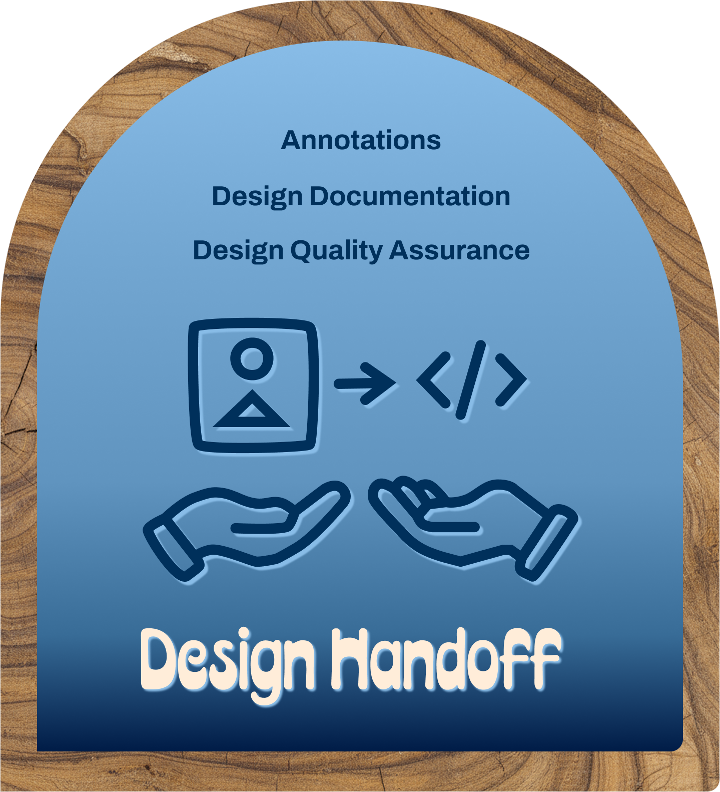
Design Handoff
Once the high-fidelity designs were approved, I prepared the files for the development team and imported them into Zeplin. This enabled me to add detailed annotations, document interaction behavior, and ensure every component aligned with the design system. Through Zeplin, developers could inspect assets, extract code, and identify reusable components from the shared library. This handoff process created complete transparency across teams and set a clear, actionable foundation for implementation.
Design Documentation
To support a smooth implementation, I created detailed design documentation outlining the intended behavior, states, and interactions for each component and screen. This documentation gave the development team clear guidance on how the experience should function and ensured consistency with the established design system. Throughout implementation, I partnered closely with developers to answer questions, refine edge cases, and verify that the build accurately reflected the documented design decisions.
Annotations
For this project, I imported the Figma designs into Zeplin, giving engineers a clear, inspectable version of every layout and component. In Zeplin, I added detailed annotations describing interaction behavior, variable states, and the exact hex codes and patterns used across the interface. This level of clarity helped the development team understand design intent, align with the reusable component library, and implement the dashboard more accurately and efficiently.
Design Quality Assurance
To ensure the build matched the intended experience, I led Design Quality Assurance (DQA) sessions throughout development. During these reviews, I walked through each screen with the engineering team, compared the implementation against the high-fidelity designs, and documented any discrepancies. I then translated this feedback into clear backlog stories, allowing developers to make targeted updates. This process ensured the final product accurately reflected the approved design specifications.
Key Performance Indicators + Analytics
To measure the early impact of the new dashboard, I used Pendo to analyze how users interacted with the feature in real time. Tracking these engagement patterns helped determine whether the design supported the workflows we intended to streamline. Reviewing key performance indicators provided clear evidence of design effectiveness and reinforced why thoughtful user experience investments directly contribute to product success and overall user satisfaction.
Data Analysis
By analyzing usage data in Pendo, I evaluated how users engaged with the new dashboard feature. Click metrics revealed a meaningful increase in awareness and repeat interaction, showing that users were actively exploring and relying on the dashboard. This engagement validated the design direction, demonstrated early adoption, and provided measurable evidence that the feature was delivering value to both users and stakeholders.
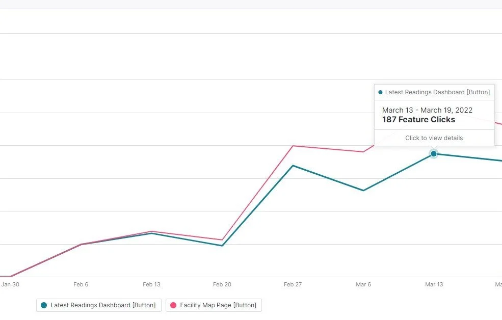
Success Metrics
Early Pendo analytics showed a strong lift in engagement with the new facility dashboard. In the first thirty days, the page recorded 2,723 visits from 516 unique accounts—a more than 30% increase in visibility compared to the previous experience. This surge in traffic demonstrated that users were not only discovering the redesigned dashboard but actively returning to it, providing clear evidence that the new design was delivering meaningful value.
User Feedback
Josh Ginsberg, Director of Cultivation at Sozo Cannabis Brands remarked that “The new facility card dashboard is a complete game changer.”
You can read more about this case study in AROYA’s grower of the month blog: SOZO - CULTIVATION SUCCESS STORY | AROYA by Addium Inc

What I learned
Throughout this project, I expanded my skill set in several meaningful ways. I deepened my understanding of Figma by using more advanced prototyping features, strengthened my communication and collaboration practices with the development team, and gained hands-on experience measuring design impact through KPIs and usage analytics. Together, these skills improved not only the quality of this project but also my overall effectiveness as a product designer.
Skills
This project strengthened my skill set in several meaningful ways. I gained deeper proficiency with Figma’s interactive prototyping features, expanded my experience building and maintaining a scalable design system library, and improved my ability to use data to evaluate design impact. These capabilities not only supported clearer communication with stakeholders and developers but also helped demonstrate how the new dashboard meaningfully improved user engagement and product performance.
Themes
One of the most impactful themes from this project was the value of speaking directly with users. These conversations revealed practical insights about their workflows and surfaced ideas that wouldn’t have emerged through documentation alone. Users were quick to point out where the platform supported them and where it created friction, helping shape improvements that made their day-to-day responsibilities more efficient and the product overall more effective.

Insights
Designing for a clearly defined user base is one of the most rewarding parts of my work. This project reinforced how meaningful it is to use creativity in a way that genuinely improves people’s daily lives and productivity. Crafting solutions that remove friction, support real workflows, and make complex tasks easier reminds me why I’m drawn to product design—it's a discipline where thoughtful problem-solving translates directly into human impact.