Prescription Refill Flow
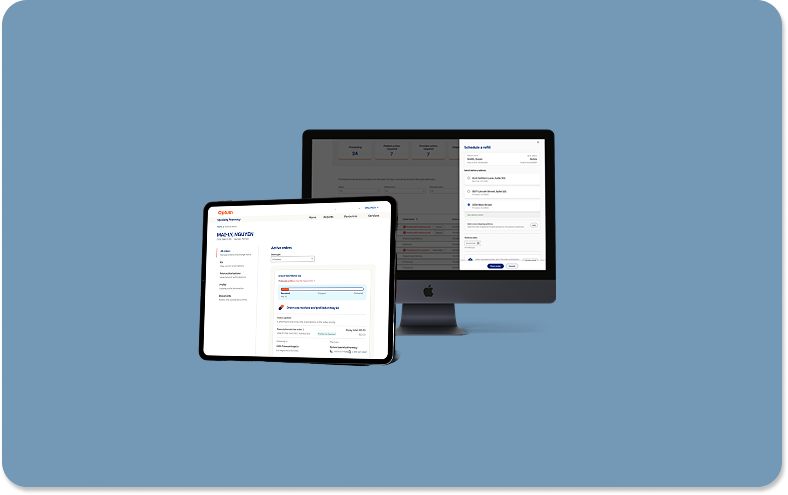
Overview: I redesigned the digital prescription refill experience for healthcare providers, streamlining multi-patient order management into a seamless, automated workflow that reduced manual processing time.
Product: Optum Specialty Provider Portal // Company: United Healthcare
Role: Senior UX Engineer // Contributions: Research, Wireframes, Mockups, Prototypes, Stakeholder Presentation
Team: Product Lead // Provider Surface Lead // Principle Designer // Design Director // Accessibility Partners // Development Engineers
Technology: Figma for Design // Rally for Development Handoff // Microsoft Teams for Collaboration


Project Summary
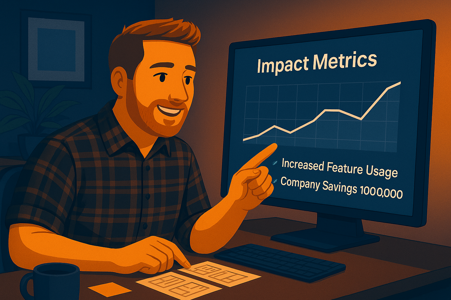
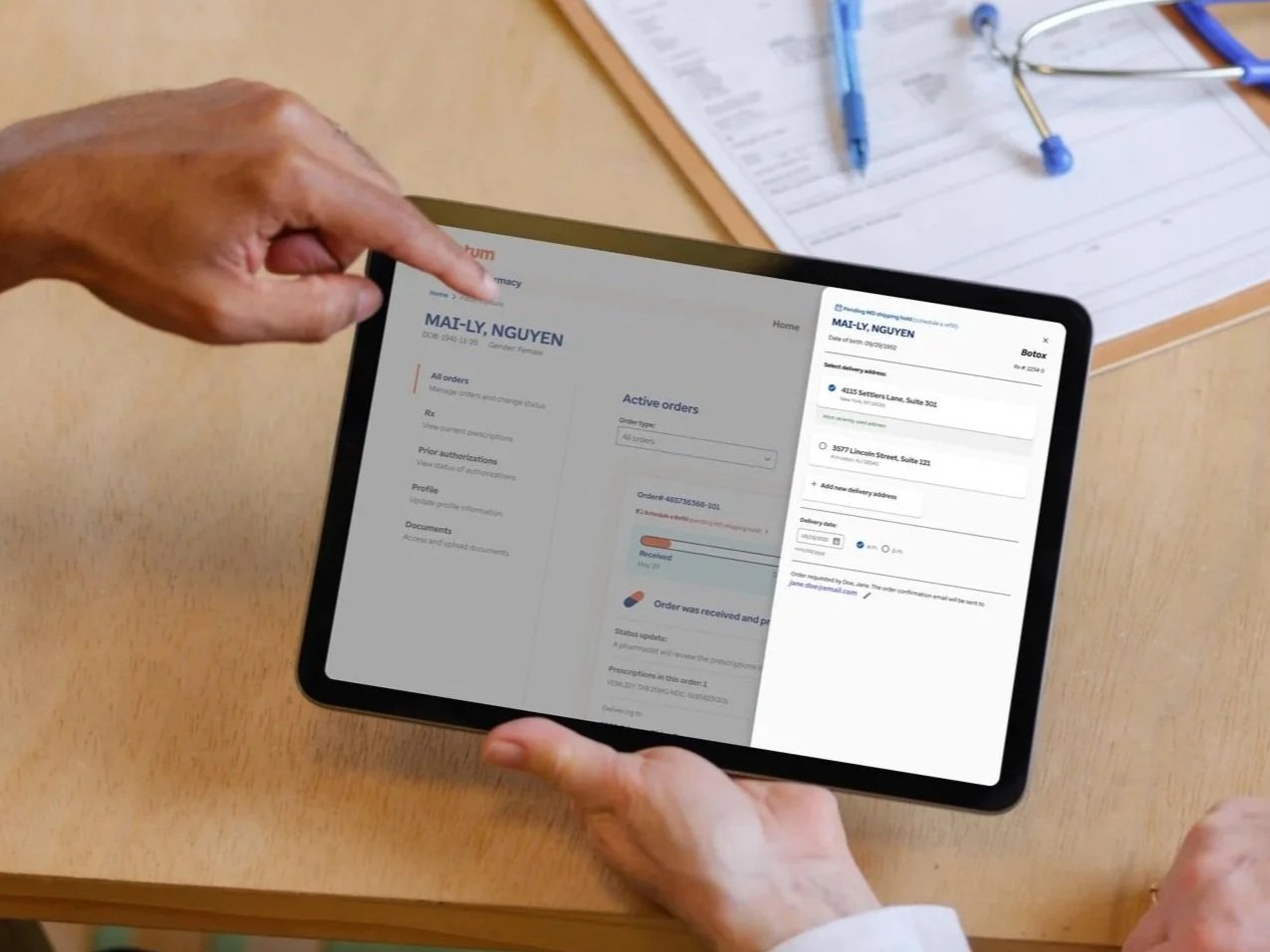
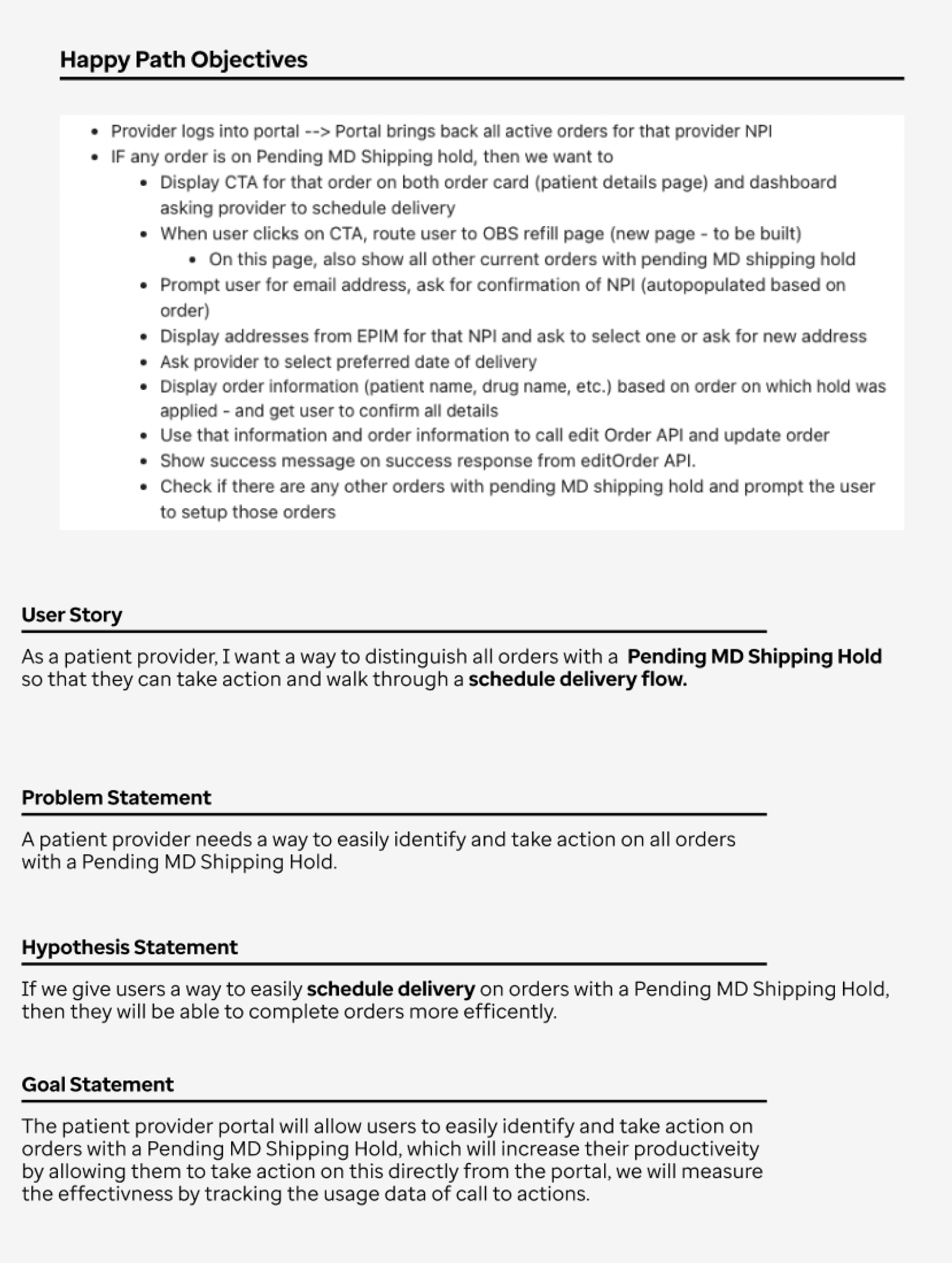
I designed and implemented a digital prescription refill flow that enabled healthcare providers and their assistants to refill patient orders directly within Optum’s Specialty Provider Portal—eliminating the slow, manual process of calling in refills. The new interface allows users to quickly identify and prioritize orders with an “MD shipping hold” status, open a refill drawer to review or edit patient information, select delivery dates, and process multiple orders consecutively in a single session. This significantly reduced manual steps, improved turnaround time, and enhanced provider satisfaction. I partnered closely with product and engineering stakeholders to define requirements, create wireframes and high-fidelity prototypes, and ensure pixel-perfect implementation. The product owner estimated the new digital workflow would save over $100,000 annually by reducing call-center dependency and increasing operational efficiency.
Problem Statement: Providers had to manually call in prescription refills. This created workflow inefficiencies and raised operational costs.
Goal Statement: Create an intuitive digital refill experience that allows providers to review and process all pending prescription orders in one place—reducing manual labor, accelerating turnaround time, and improving overall workflow efficiency.
The Process
Discovery + Research
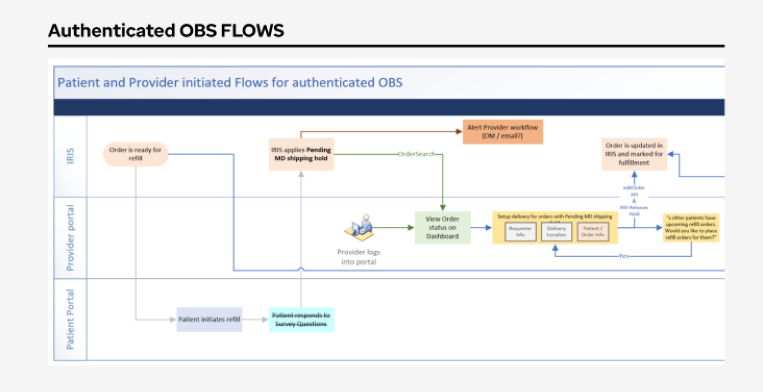
The design process began with close collaboration with the product manager to gather requirements and map initial user flows. Together, we outlined the existing experience to pinpoint key pain points and opportunities for improvement. From there, we defined user stories and goal statements to clarify the intended outcomes. This phase also included determining which data could be pre-populated to streamline the workflow and identifying any information that would still need to be collected from the user.
User Experience Design
After gathering requirements, I created low-fidelity wireframes to explore layout and interaction options that would best support provider workflows. During this phase, we evaluated multiple user flows and compared patterns—such as using a drawer, a modal, or navigating to a new page—to determine the most intuitive approach. I began with quick paper sketches to iterate rapidly, then translated the strongest concepts into digital wireframes in Figma for deeper refinement.
User Interface Design
After finalizing the approach for the refill flow, I partnered with the copywriters and design system team to bring the solution into high fidelity. Using established components, color variables, iconography, typography, and spacing tokens, I built polished mockups that accurately reflected the system’s visual language. This ensured consistency across screens and allowed stakeholders to clearly understand how the refined workflow would look and function within the live product.
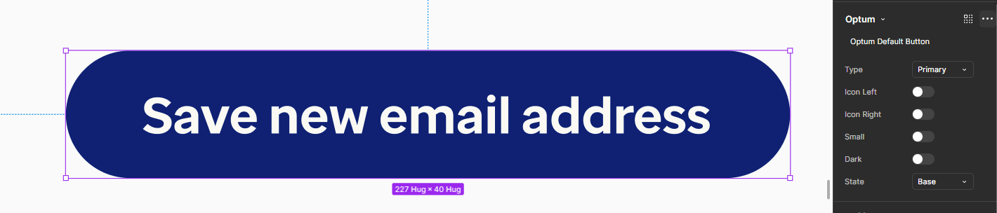
Interactive Prototyping
To bring the workflow to life, I connected the high-fidelity screens to build an interactive prototype that showcased the full interaction flow and user journey. This enabled stakeholders to experience the refill process firsthand, evaluating transitions, interactions, and overall usability. Walking through the prototype during final reviews allowed us to collect focused feedback, confirm cross-team alignment, and prepare the experience for development with confidence.
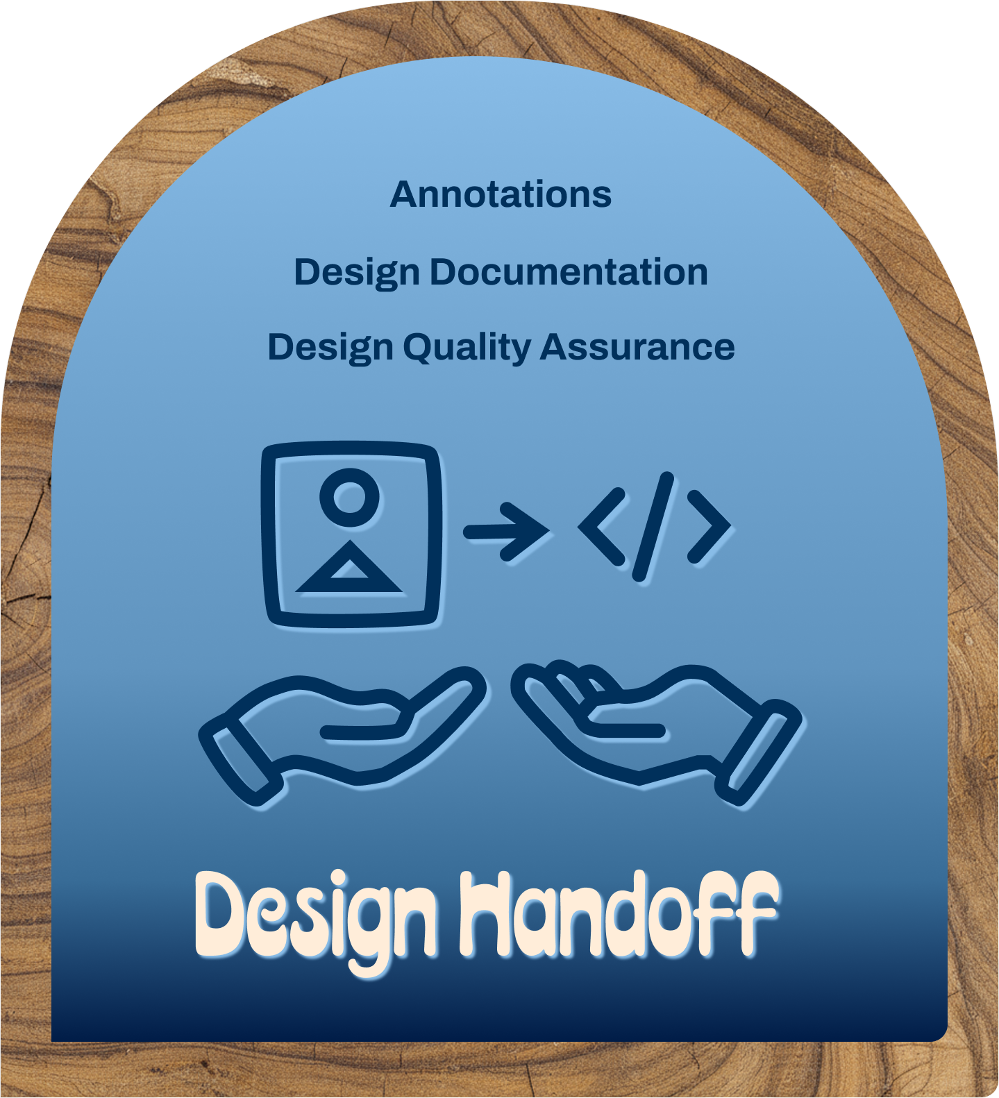
Design Handoff
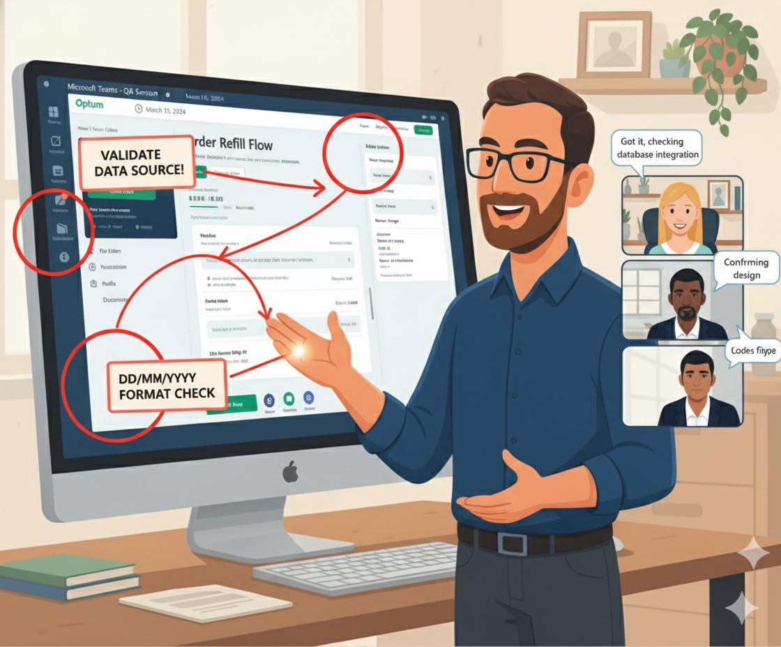
To ensure a smooth transition from design to development, I presented the high-fidelity mockups and interactive prototype to the engineering team directly in Figma. We used Rally to hand off the finalized designs, where development tasks were created and prioritized. Once the team implemented the workflow, I partnered with engineering to conduct detailed design quality assurance, verifying that each screen, interaction, and component aligned with the approved specifications.
KPI + Analytics
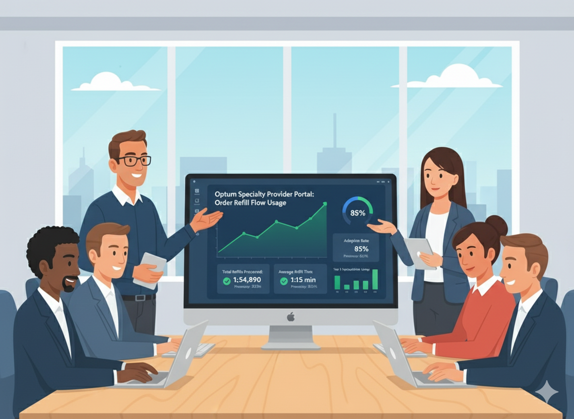
With the redesigned refill flow live, I met with the product owner to evaluate its real-world impact. Before this update, providers had to call the call center to place every refill order. The new digital workflow allows them to process refills directly through the portal, dramatically reducing manual phone calls. This shift led to a significant drop in call center volume and generated more than $100,000 in annual savings.

Discovery + Research
To ground the project in a clear understanding of user needs, we began with research and discovery. I partnered closely with the product lead to define requirements, align on a design strategy, and map the initial user flows. This early collaboration helped the design, product, and engineering teams articulate the core problems we needed to solve and ensured that every decision moving forward was rooted in a shared understanding of the user experience.
Requirements + Design Strategy
As we defined the project direction, I partnered with the product lead to clarify requirements and shape a strategy focused on streamlining refill management. A key objective was to help users quickly identify orders with a pending shipping hold and to provide a clear call to action button (CTA) that triggered a guided digital workflow. To measure adoption, we planned to track CTA engagement and determine how many providers transitioned from phone-based refills to the new digital process.
User Flows
To better understand the end-to-end workflow, I mapped detailed user flows outlining each step a provider would take during the refill process. These flows clarified how users moved through the experience and revealed where key decisions and data points occurred. Creating this level of clarity early on also helped the engineering team determine which back-end databases and systems would need to support each stage of the workflow.
User Experience
With a clear foundation from our research, I transitioned into the user experience phase by exploring early design concepts through paper wireframes. These sketches helped quickly visualize layout options before moving into digital wireframes and a low-fidelity prototype in Figma. Once the initial ideas were defined, I reviewed the prototype with internal stakeholders to gather feedback, validate key assumptions, and refine the direction before moving into higher-fidelity design work.
Paper Wireframes
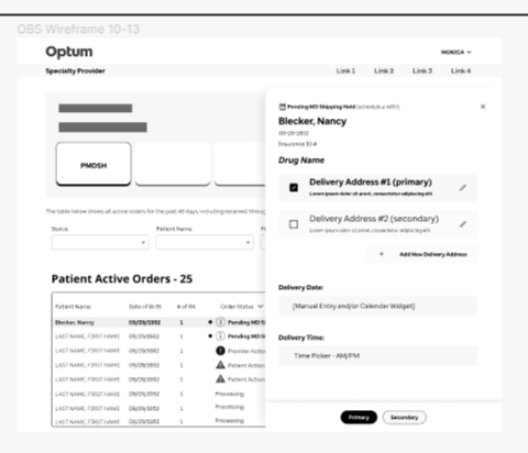
To explore early layout and interaction ideas, I sketched multiple paper wireframes to rapidly test different structural approaches for the refill experience. This quick iteration helped us evaluate whether the workflow should open in a drawer, a modal, or a dedicated page. After comparing options against established design patterns, we chose a drawer-based approach, ensuring consistency with the rest of the portal and minimizing disruption to the provider’s workflow.

Digital Wireframes
After collecting feedback from stakeholders , I transitioned the paper wireframes into digital form using Figma. During the UX phase, I intentionally kept the designs in grayscale and abstract, using simple shapes and placeholders to focus conversations on structure rather than visual polish. This level of abstraction encouraged open dialogue, invited iterative feedback, and allowed the team to refine core concepts before investing in higher-fidelity design work.
Low-fidelity Prototype
To validate the interaction flow, I transformed the digital wireframes into a low-fidelity prototype that illustrated how providers would move through the refill process. The prototype guided users from selecting an item on the dashboard to opening a drawer and entering the required information. It also demonstrated how the workflow connected to HEMI, the underlying database, enabling digital submission and eliminating the need for manual phone calls.

User Interface Design
As the interaction flow solidified, I shifted into the user interface phase to translate the concepts into high-fidelity designs. Using the established design system, I applied components, typography, color variables, and spacing tokens to create a polished interface that reflected real product behavior. Throughout this stage, I ensured the designs adhered to accessibility standards, helping the experience feel visually consistent and production-ready.
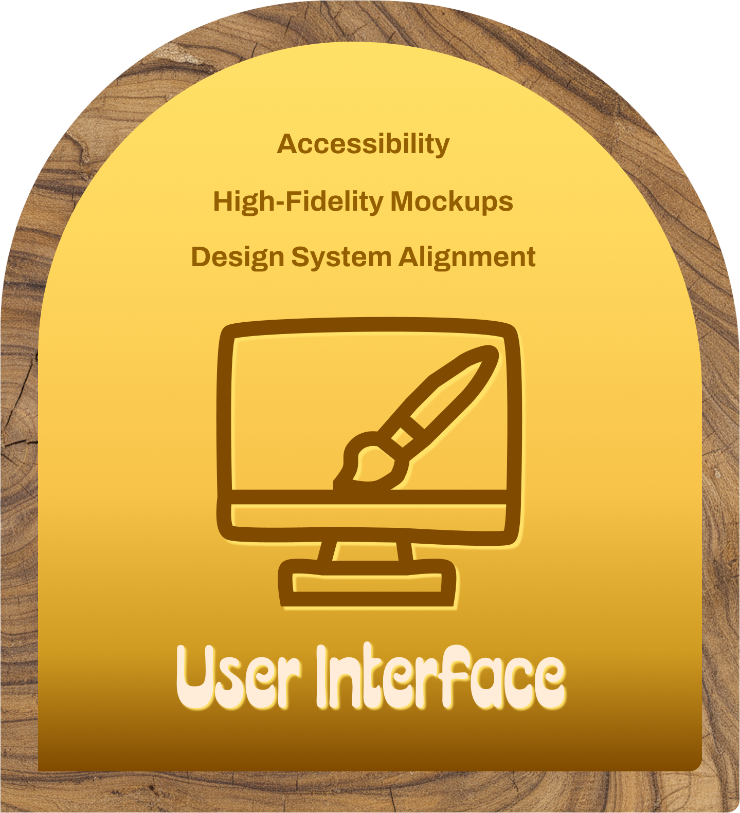
High-Fidelity Mockups
To bring the experience closer to its final form, I refined the low-fidelity wireframes into high-fidelity mockups using components from the shared design and development system. By aligning each screen with the established UI library—colors, typography, spacing, and interaction patterns—I ensured consistency across the product. These designs not only reflected how the experience would function in production but also allowed engineering to begin mapping real components to the layout.
Design System Alignment
Maintaining alignment with the design system was critical to ensuring visual consistency as the new refill flow took shape. I relied on reusable components, color palettes, and spacing tokens that mapped directly to our front-end library, allowing the interface to stay cohesive with the rest of the platform. This approach strengthened consistency across screens and streamlined development by ensuring every UI element was already supported within the existing component framework.
Accessibility
Accessibility was a core consideration during the UI phase, especially given the importance of clarity in healthcare workflows. To support users with varying visual abilities, I evaluated each screen using a color contrast checker to ensure all interface elements met accessibility standards. Prioritizing contrast and legibility not only improved inclusivity but also enhanced the overall usability and reliability of the refill experience for every user.

Interactive Prototypes
To bring the experience to life, I connected the high-fidelity screens into an interactive prototype that demonstrated the full end-to-end refill workflow. This prototype showcased each interaction in context, giving stakeholders a realistic sense of how providers would navigate the system. Reviewing the prototype together allowed us to validate the flow, collect final feedback, and secure approval before handing the designs to the development team for implementation.
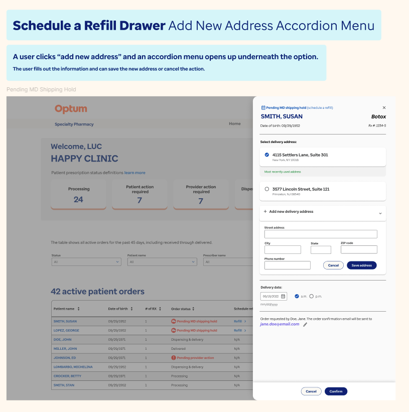
High-Fidelity Prototype
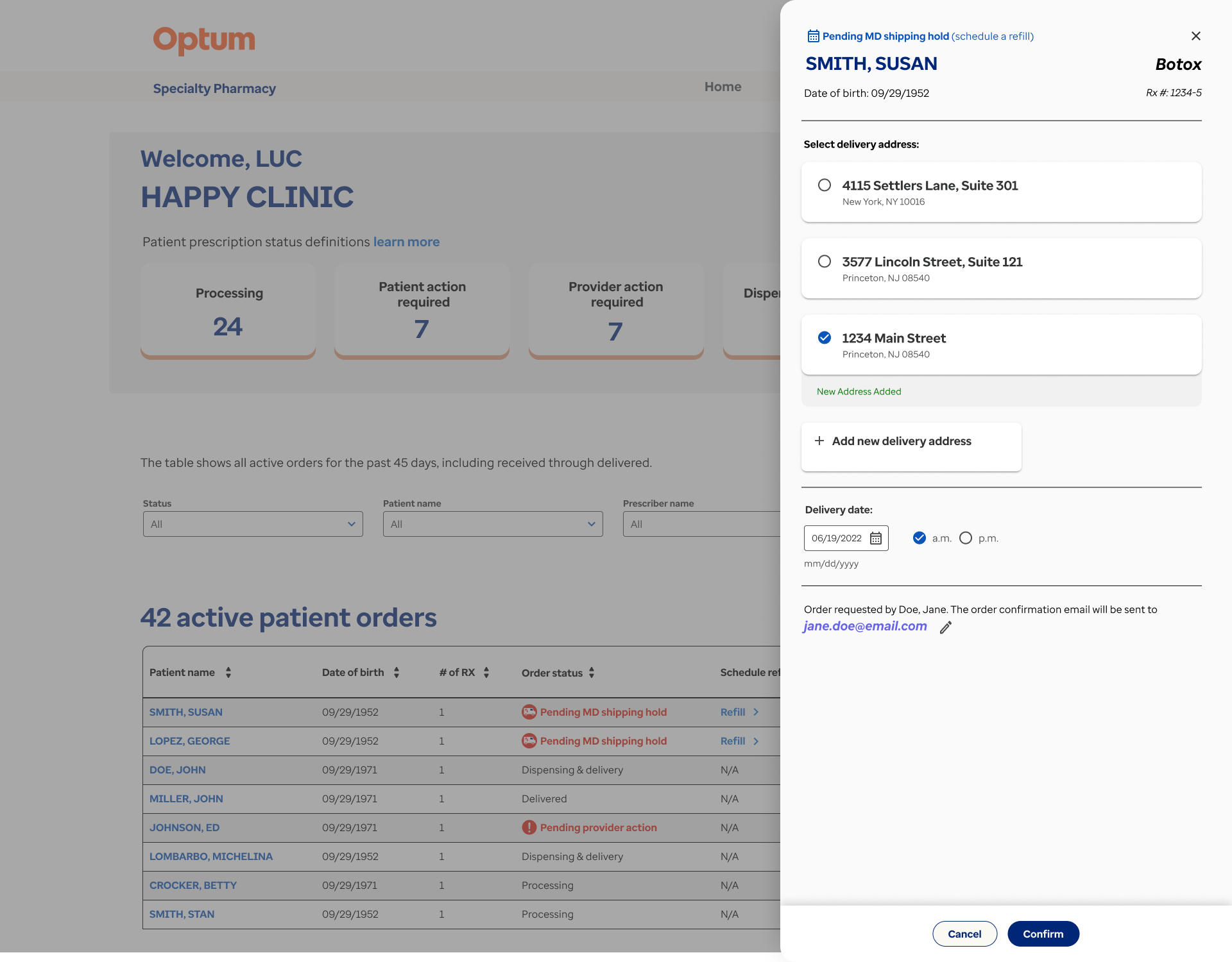
Building on the initial prototype, I created a high-fidelity version in Figma that showcased the full experience for managing shipping holds and processing refill actions. The flow leveraged existing patient data while giving providers the flexibility to update information such as addresses or emails as needed. By connecting all orders requiring attention into a single, guided sequence, the prototype demonstrated how physicians and assistants could complete every task efficiently within one streamlined workflow.
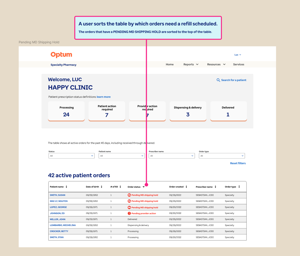
Interaction Design
To refine the interaction design, the high-fidelity prototype illustrated how users would identify and complete refill tasks within the new workflow. We introduced the ability to sort what was previously a static table, helping providers quickly pinpoint orders requiring attention. The drawer interaction enabled users to complete refills while maintaining context, aligning with established system patterns. We also determined which fields could be prepopulated from backend data and where users could update patient details when needed.
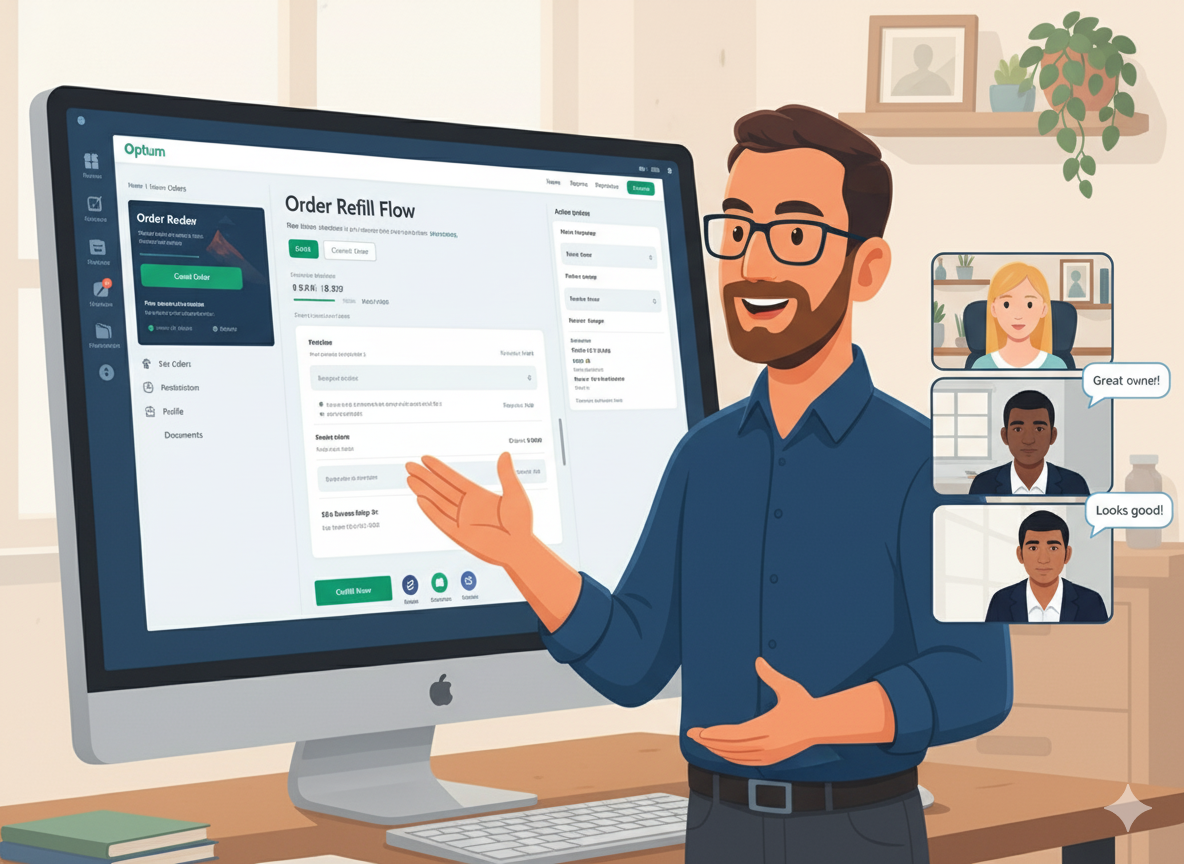
Stakeholder Presentation
To finalize the experience, I presented the high-fidelity prototype to key stakeholders—including product owners, developers, and fellow designers—to walk through the complete user flow. Reviewing the prototype together allowed each group to evaluate the interactions in context, confirm the accuracy of the workflow, and provide any last refinements. This collaborative session ensured that the final design was fully aligned across teams before moving into development.
Design Handoff
Once the designs were approved, I transitioned them into development by presenting the finalized screens to the engineering team and annotating key interaction details directly in Figma. We used Broadcom’s Rally platform to add the designs into the sprint backlog, ensuring each task was clearly defined and aligned with project priorities. This structured handoff provided engineers with the clarity needed to begin implementation with confidence.
Design Documentation
To support a smooth implementation process, I created a detailed design documentation file outlining every screen in the user flow. Each page included titles, context, and written descriptions to clarify expected behaviors and interaction patterns. I then walked the development team through the document so they had a reliable reference during buildout, ensuring the final product aligned closely with the approved high-fidelity designs.

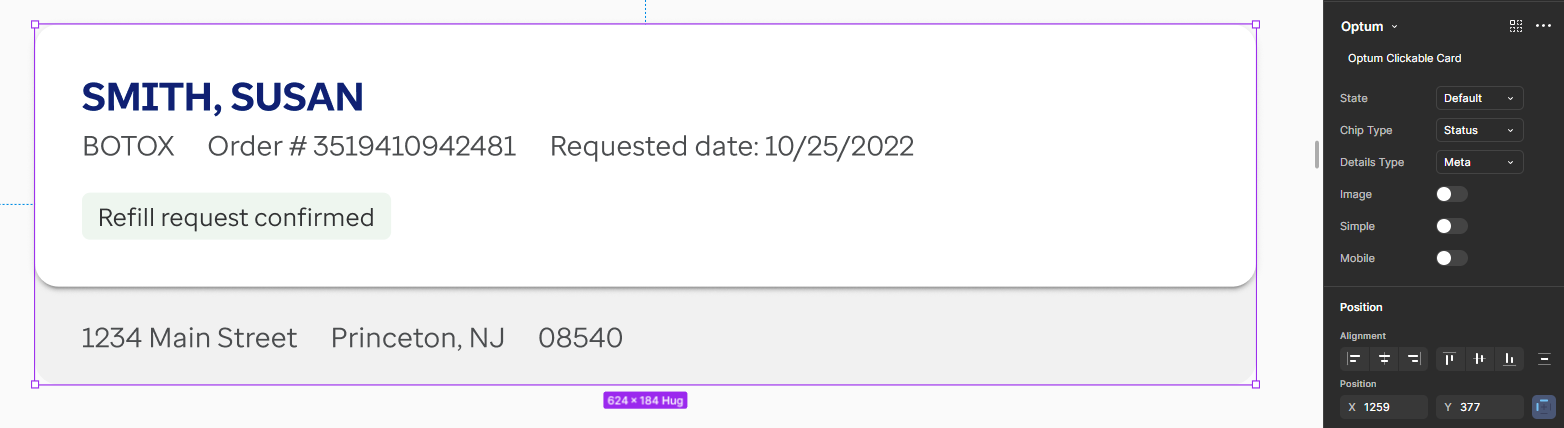
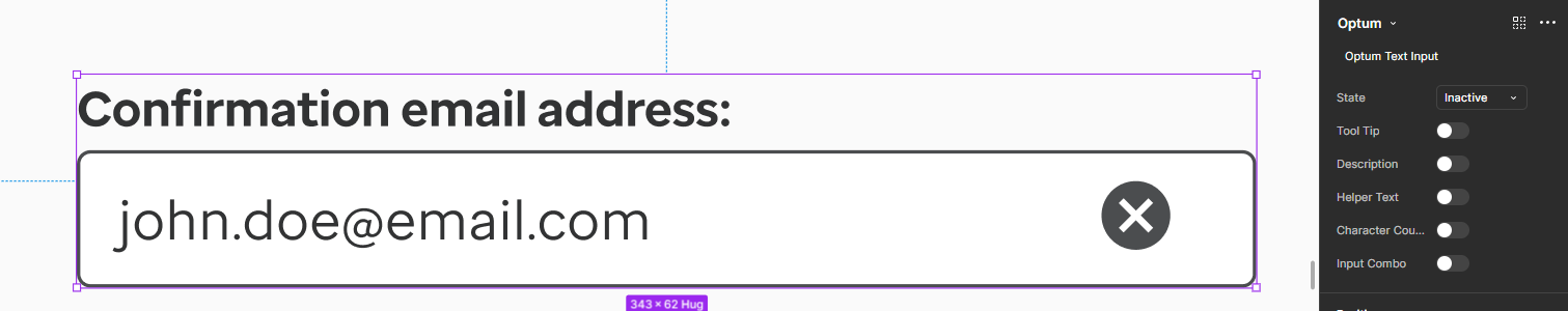
Annotations
To further support development, I added detailed annotations directly onto the high-fidelity designs, documenting interaction behaviors as well as the visual specifications needed for accurate implementation. These notes clarified component states, color values, typography, and spacing tokens, giving engineers a precise reference throughout the build. By outlining these details upfront, the team could implement each screen with greater confidence and consistency, reducing ambiguity during development.
Design Quality Assurance
To ensure the build accurately reflected the approved designs, I led a design quality assurance (DQA) review with the development team. During these sessions, we compared each implemented screen against the high-fidelity mockups and documentation, identifying discrepancies in layout, spacing, and component states. I then provided clear, actionable revisions to bring the experience back into alignment, helping maintain design consistency throughout the final implementation.
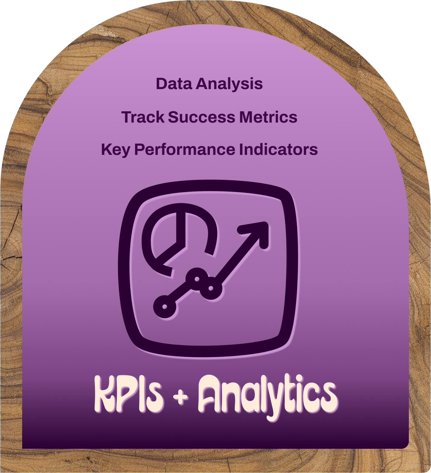
Key Performance Indicators + Analytics
To measure the impact of the new refill workflow, I collaborated with the product owner to track key performance indicators tied to feature adoption and efficiency. We monitored metrics such as CTA engagement and the volume of digital refill submissions, comparing them to previous call-center activity. These data points helped quantify the value of the redesign and demonstrated how the new digital process contributed to meaningful operational savings.
Success Metrics
Several months after launch, I reconnected with the product owner to review usage metrics and understand the real-world impact of the new workflow. The refill feature was being used dozens of times per day by prescribers, significantly reducing reliance on call-center support. By shifting these interactions to a digital experience, the system generated more than $100,000 in annual cost savings while improving efficiency for providers.
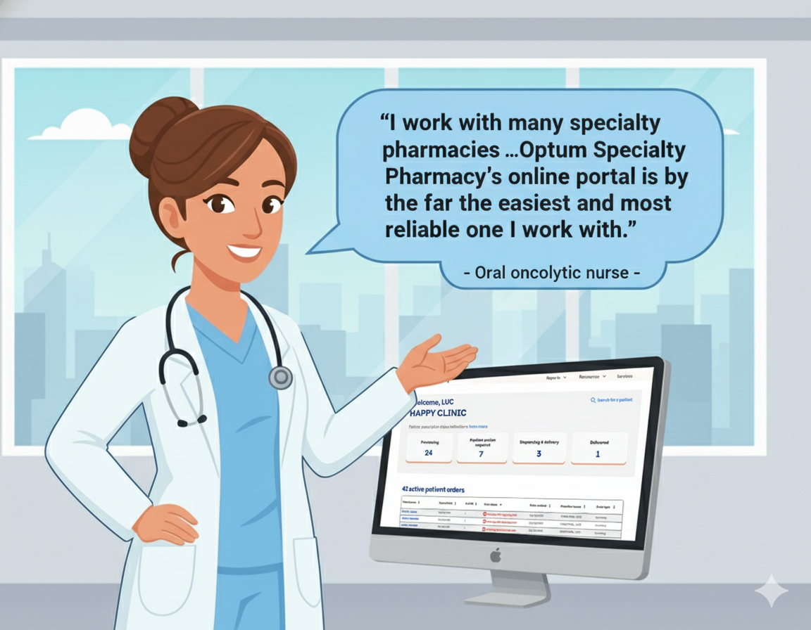
Direct User Feedback
“ I work with many specialty pharmacies ... Optum Specialty Pharmacy’s online portal is by the far the easiest and most reliable one I work with. ”
- Oral oncolytic nurse & Optum Specialty Pharmacy Portal user

What I learned
This project reinforced how critical it is to define interaction patterns early, as those decisions shape every subsequent design choice. I also gained practical experience collaborating with engineering to understand which patient details could be prepopulated from backend systems and which fields required manual input. Balancing these considerations helped me design a workflow that felt intuitive for users while remaining grounded in the technical realities of the platform.
Skills
One of my key takeaways from this project was recognizing the importance of defining interaction design patterns early in the process. Establishing these decisions upfront aligned the team on a clear strategy and prevented unnecessary rework later in the project. This experience reinforced how early pattern selection creates a stable foundation for both user experience and technical implementation.
Themes
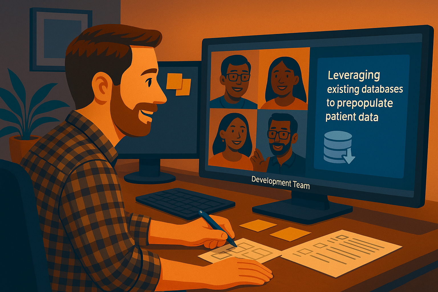
Another key insight from this project was recognizing the impact of leveraging existing backend databases to prepopulate patient information. Applying data intelligently allowed us to remove unnecessary steps, reduce friction in the workflow, and make the refill process feel more seamless for providers. Seeing how small data-driven optimizations could materially improve efficiency reinforced the importance of aligning UX decisions with technical capabilities.
Insights
Understanding the measurable financial impact of this feature was another important learning from the project. Connecting the redesigned workflow to a concrete cost-savings figure highlighted how thoughtful UX decisions can improve daily provider efficiency while also delivering meaningful value to the business. Seeing how design directly contributed to reducing operational expenses reinforced the importance of evaluating both user outcomes and organizational ROI.